SUMMARY
We partnered with Plectica (a visual mapping tool company) to redesign a feature called "Perspective-taking."
The feature is developed from a cognitive science theory called DSPR Theory (Distinction, System, Perspective, Relation), a process to structure information and improve people's thinking skills.
Capstone Group Members: Asuka Takano, Garrett Mar, Jamie Heeyun Byun
Duration: 4 months
Role: UX Research Lead
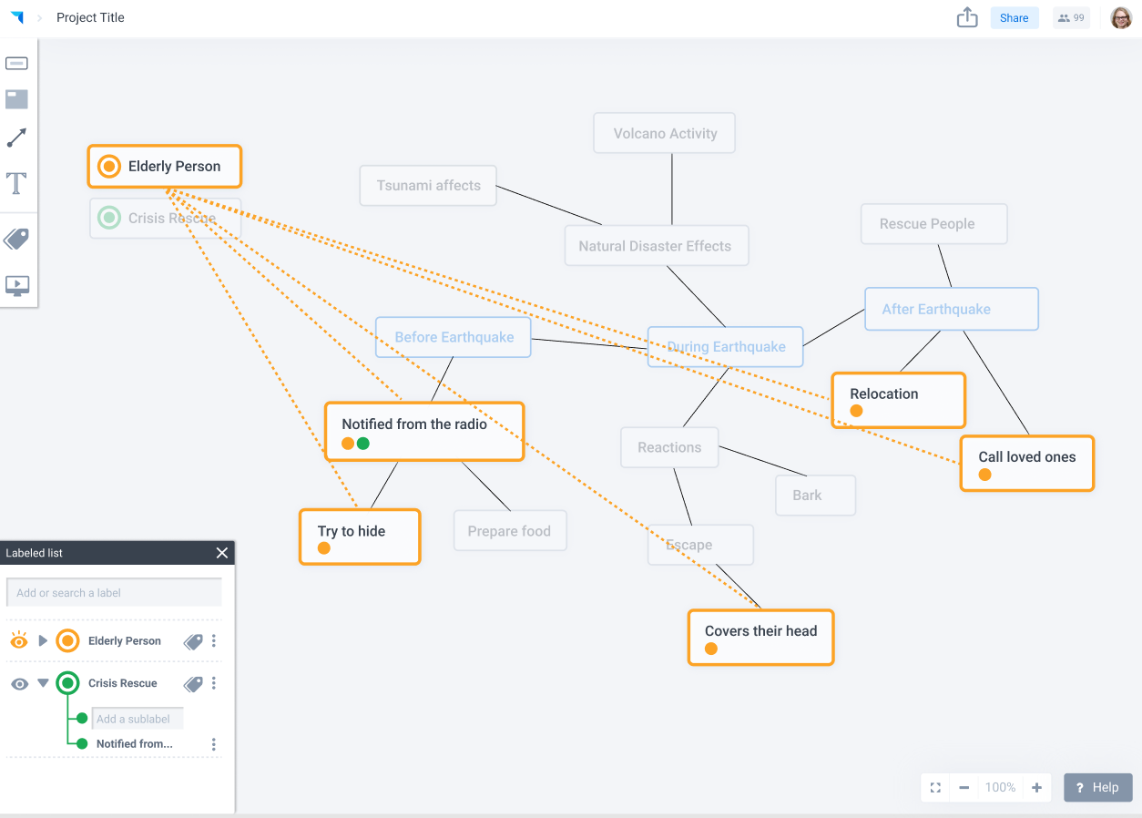
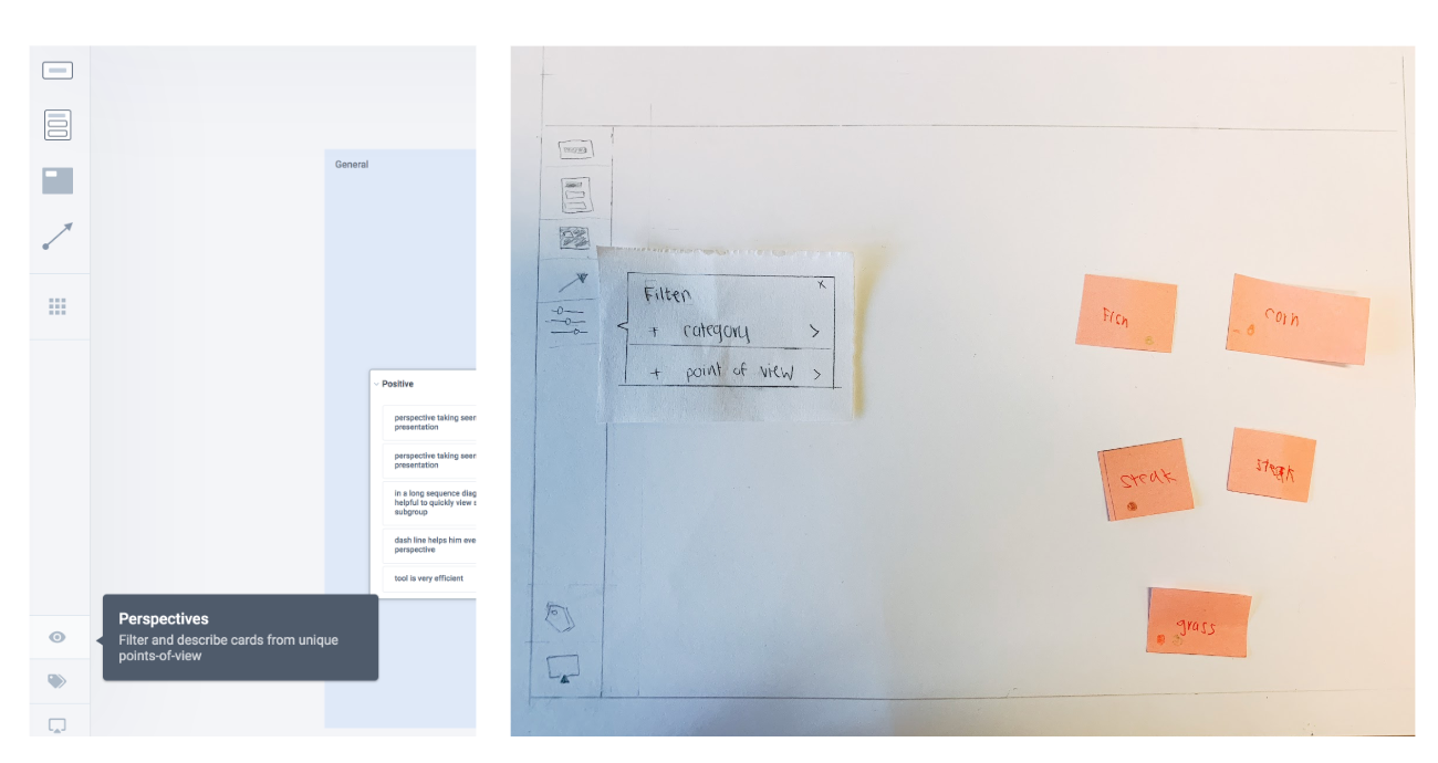
Final Redesign Interface
PROBLEM
The "Perspective-taking" feature is developed from the cognitive science theory and has not done in-depth usability testings. From our team's initial analysis on the previous usability testing recordings from Plectica, users could not use Perspective-taking feature because they did not know what Perspective-taking means and how they can used the feature.
GOAL
- Clarify feature definition
- Explore more user scenario
- Improve the usability of the feature
- Explore more user scenario
- Improve the usability of the feature
Initial Design:
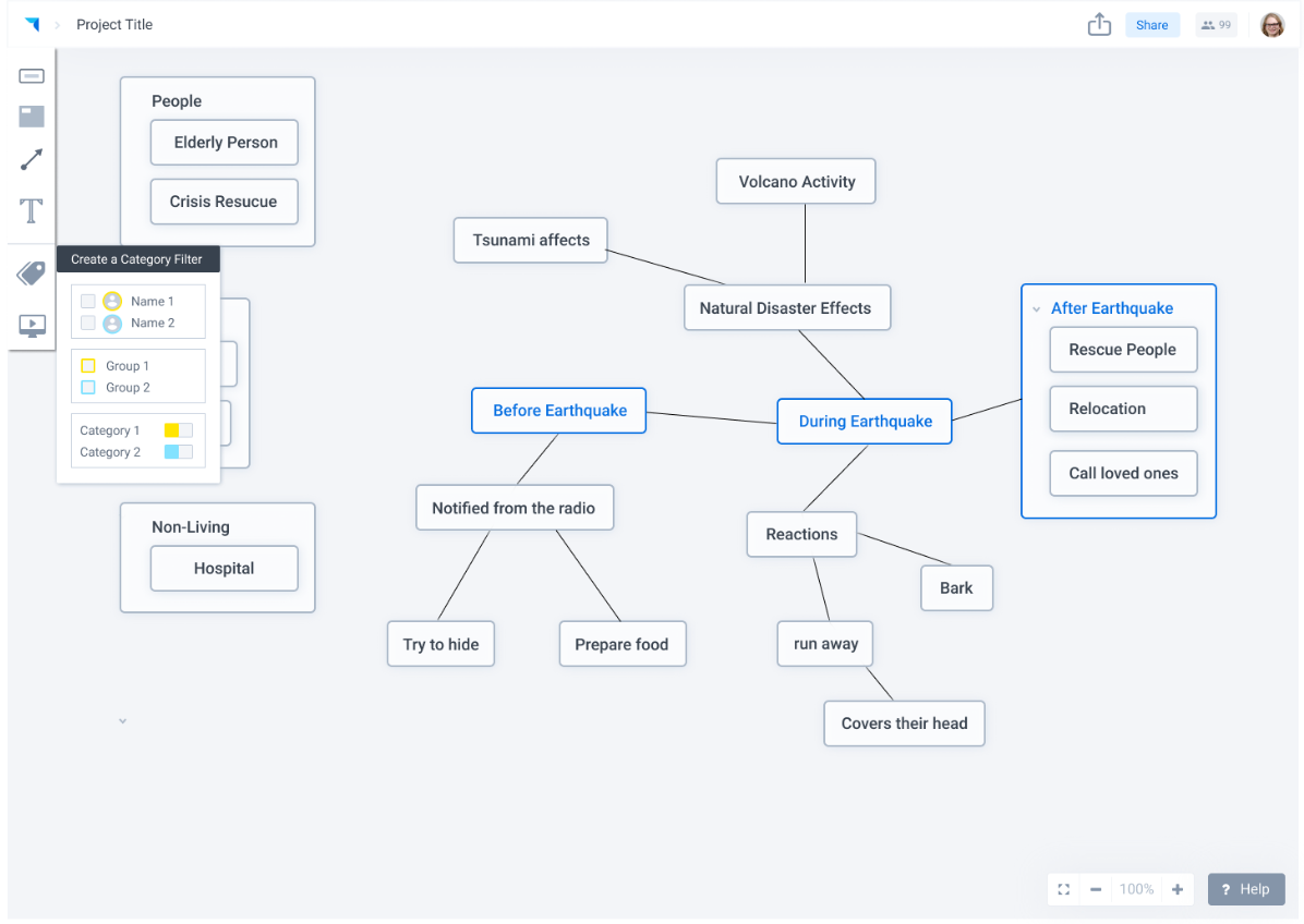
General Goal: Allow users to see different perspectives in one complex diagram.
Users can select one perspective and see all cards that are related to the perspective
Users can label cards with a dot icon for a specific perspective that is represented by an eye icon
Users can select one perspective and see all cards that are related to the perspective
Users can label cards with a dot icon for a specific perspective that is represented by an eye icon
Initial Design: Map with Left Perspective Sidebar
Watch video below to understand Perspective-taking tool and how its used.
After getting familiar with Plectica and Perspective-taking feature, we came up with the overarching question:
" HOW CAN WE IMPROVE THE USABILITY OF PERSPECTIVE-TAKING
TO SUPPORT USERS TO
ORGANIZE, EMPATHIZE, AND SHARE
THEIR PERSPECTIVES MORE VISUALLY AND EFFICIENTLY "
TO SUPPORT USERS TO
ORGANIZE, EMPATHIZE, AND SHARE
THEIR PERSPECTIVES MORE VISUALLY AND EFFICIENTLY "
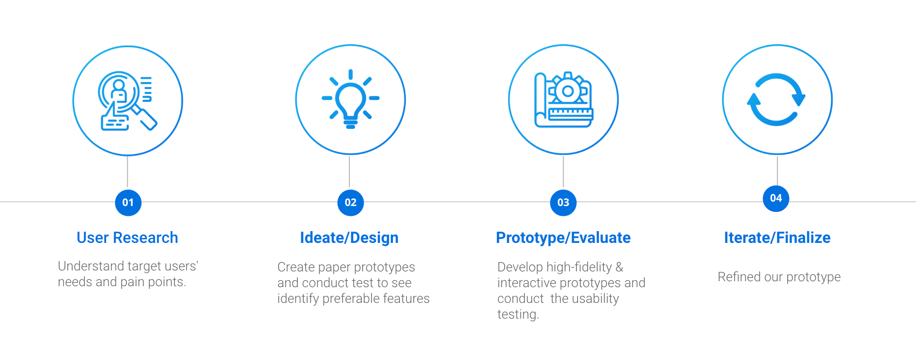
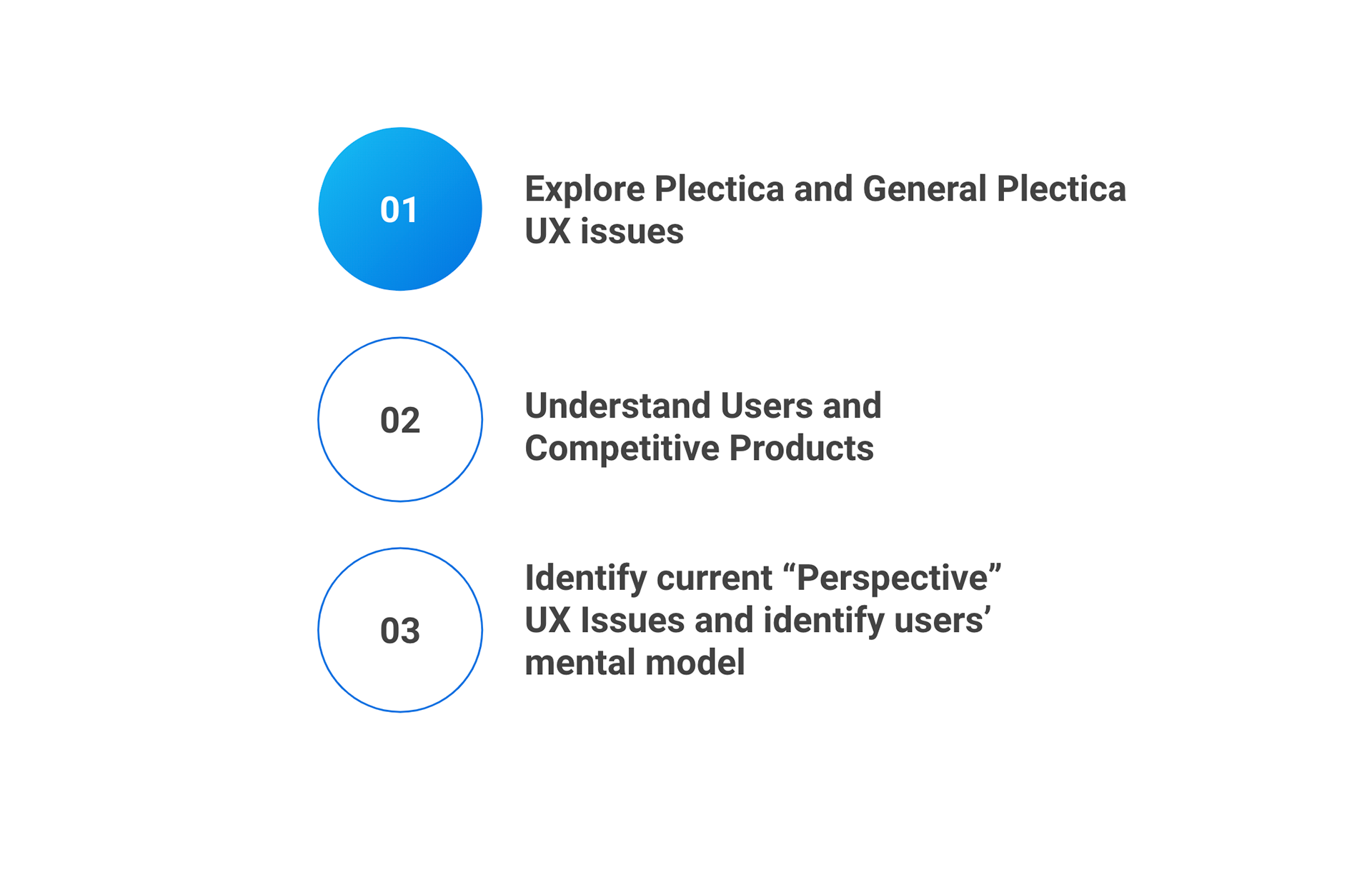
USER RESEARCH PROCESS:
Goal: Understand Targeted Users and identify the pain-point that users had and what are the scenarios that users have to use Perspective-Taking.
1. Secondary Research on previous usability studies
2. Heuristic Evaluation + Cognitive Walkthrough
3. Competitive Analysis
4. Persona
5. Design Requirement
1. Secondary Research on previous usability studies
2. Heuristic Evaluation + Cognitive Walkthrough
3. Competitive Analysis
4. Persona
5. Design Requirement
Our first step was to familiarize ourselves with the tool by watching the usability video as a novice Plectica user. Thus, we would not be biased with the observations.
1.SECONDARY RESEARCH
Familiarize with Plectica by watching previous Usability Sessions Videos
We had a general understanding of how users use Plectica from watching 5 usability testing session. The usability testing was not conducting with the latest product and only two of the videos were about Perspective-taking feature, we could see what users generally liked and the struggle when using Plectica.
2. HEUEISTIC EVALUATION
Identify usability problems that the targeted users may have
We aimed to walkthrough the actions to discover:
∙ Match between system
and the real world
∙ Consistency and standard
∙ Error Prevention
∙ Flexibility and efficiency of use
Identify usability problems that the targeted users may have
We aimed to walkthrough the actions to discover:
∙ Match between system
and the real world
∙ Consistency and standard
∙ Error Prevention
∙ Flexibility and efficiency of use
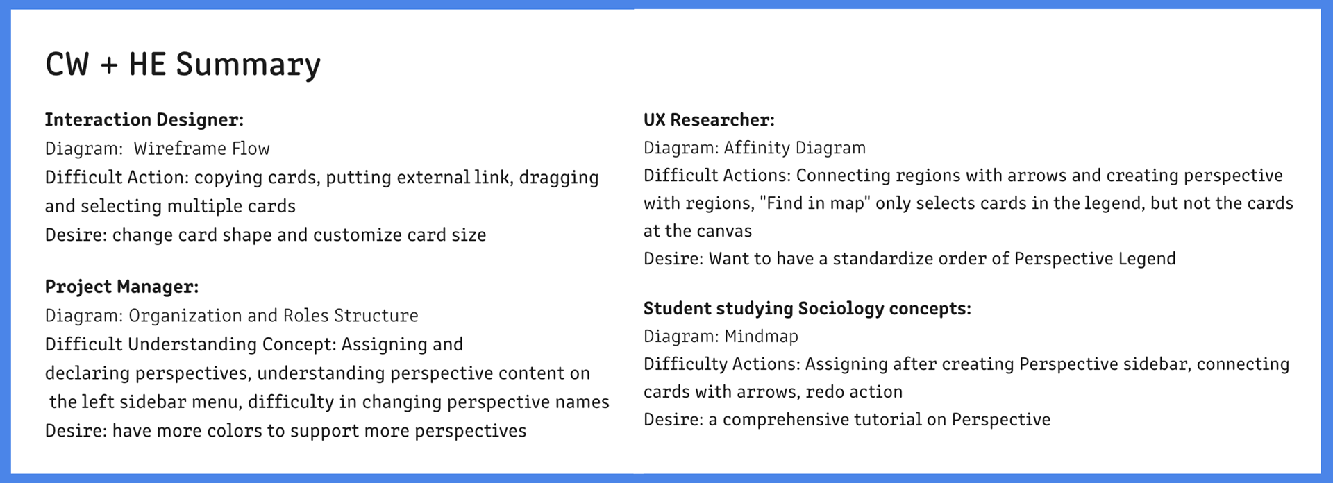
COGNITIVE WALKTHROUGH
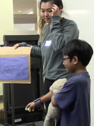
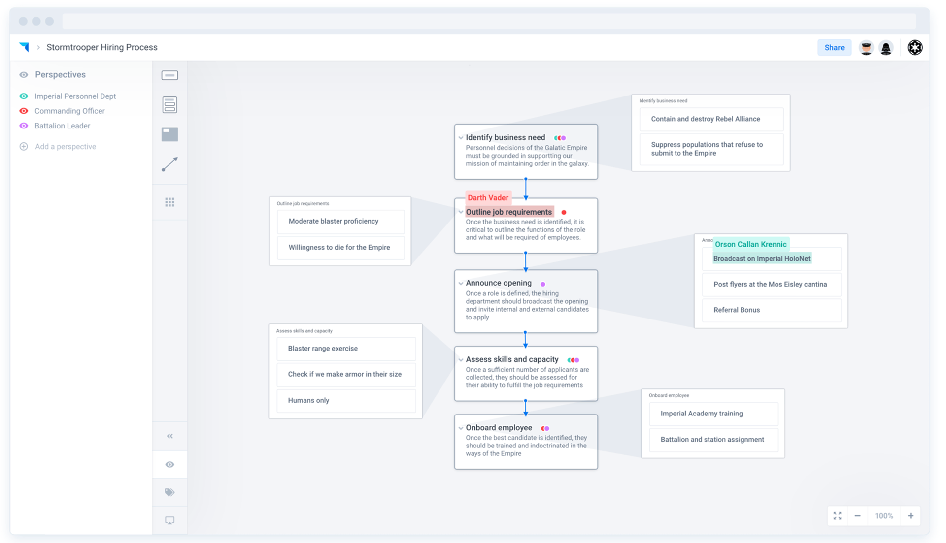
Identify more usage scenariosI assigned each of the team members a role based on their experiences and interests and a specific diagram that they will draw out with Plectica and use Perspective-taking to explore different scenarios that users would use Plectica.
FINDING
Each of the findings are categorized with a Jeffrey Rubin's severity issue ( 4 to 1 ).
Here are some findings that we considered as severity rating 4 issues:
Each of the findings are categorized with a Jeffrey Rubin's severity issue ( 4 to 1 ).
Here are some findings that we considered as severity rating 4 issues:
1. Participants were confused about the meaning of Perspective-taking features ("Primary Perspective" and "Assigned Perspective")
Common questions in the usability testings:
"What are they?", "How to use them"
Common questions in the usability testings:
"What are they?", "How to use them"
Common Behavior Problem:
Dragging the Perspective card out to either assign card or
duplicate the perspective to the map are common behaviors
that we have seen among ourselves:
duplicate the perspective to the map are common behaviors
that we have seen among ourselves:
Two of us (2/4) tried to drag when we were doing cognitive walkthrough.
Problem is that the action is not supported.
Problem is that the action is not supported.
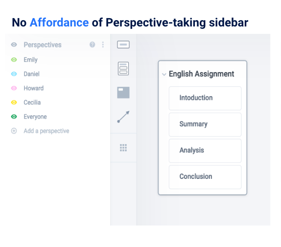
Drag to assign or drag to duplicate Perspective to card on
the map does not work even when the action has affordance
when dragging (with the dash-lines).
the map does not work even when the action has affordance
when dragging (with the dash-lines).
From the CW and HE, we realized not only the definition is not clear to the users, but the system also does not match users' mental model nor follow the convention which result the tool and feature are hard to use.
Our initial plan was to use usability testings to explore more usability issues for Plectica. From our walkthrough research and our pilot study, I realized that each user may perceive Perspective-taking differently. Therefore, they expect Perspective-taking to do different objectives.
Thus, I changed our goal from focusing on exploring “usability issues” to emphasizing on identifying “scenarios that students will utilize” the feature.
Thus, I changed our goal from focusing on exploring “usability issues” to emphasizing on identifying “scenarios that students will utilize” the feature.
According to Jakob Nielson (User Advocate and principal of Nielsen Norman Group), five participants would found 85% of the usability problems.
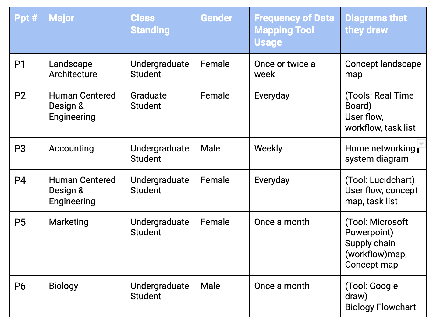
We had 6 participants in case if any participants cancelled on us.
IN-PERSON STUDY GOAL
- Learn what scenarios will students from different disciplines use the feature.
- Learn how the student will use it
- Learn how the possibility of how the student will implement the feature into their work and study.
- Learn how the student will use it
- Learn how the possibility of how the student will implement the feature into their work and study.
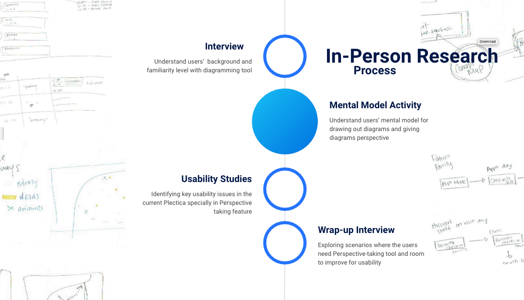
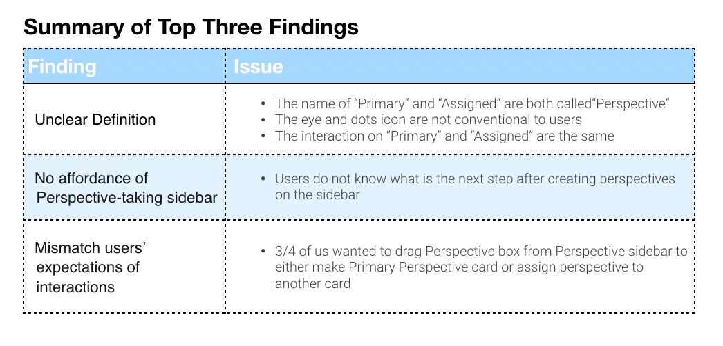
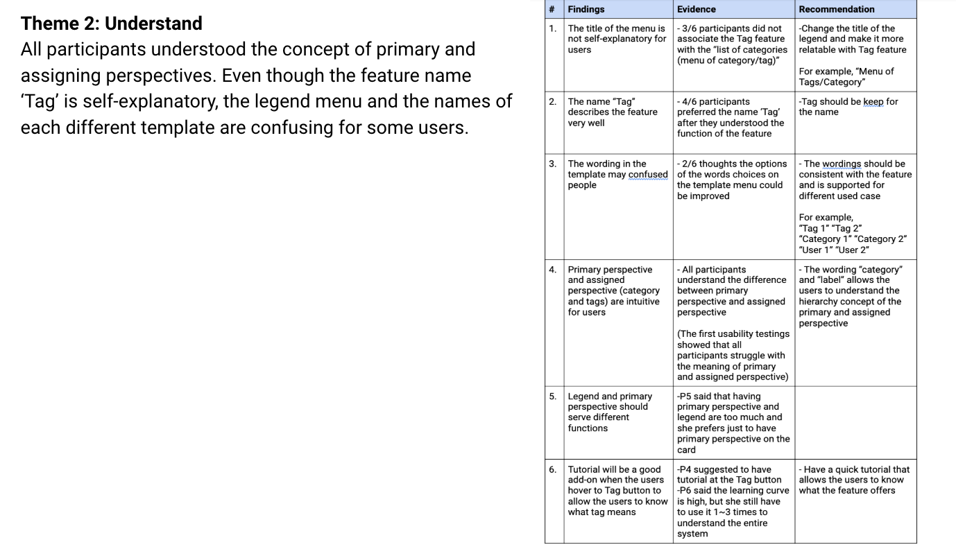
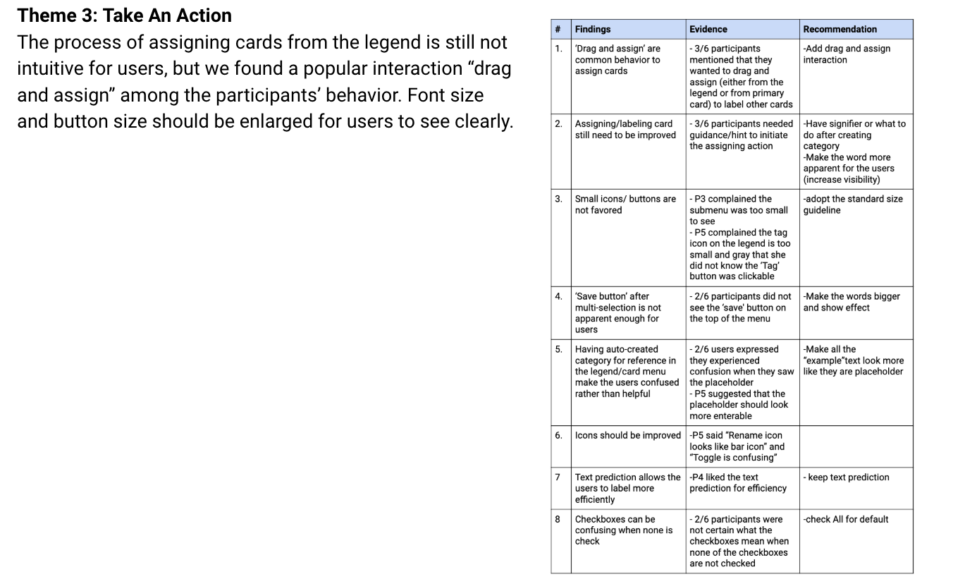
After the interviews and usability tests, we analyzed participants’ behaviors, thoughts, and issues on Plectica, specifically Perspective-taking feature. We recognized participants had similar issue patterns and classified these issues into three categories.
Discovery: find the Perspective feature.
Understand: understand the concept of the Perspective-taking tool and know how to use the Perspective-taking tool.
Take Actions: use the Perspective-taking tool.
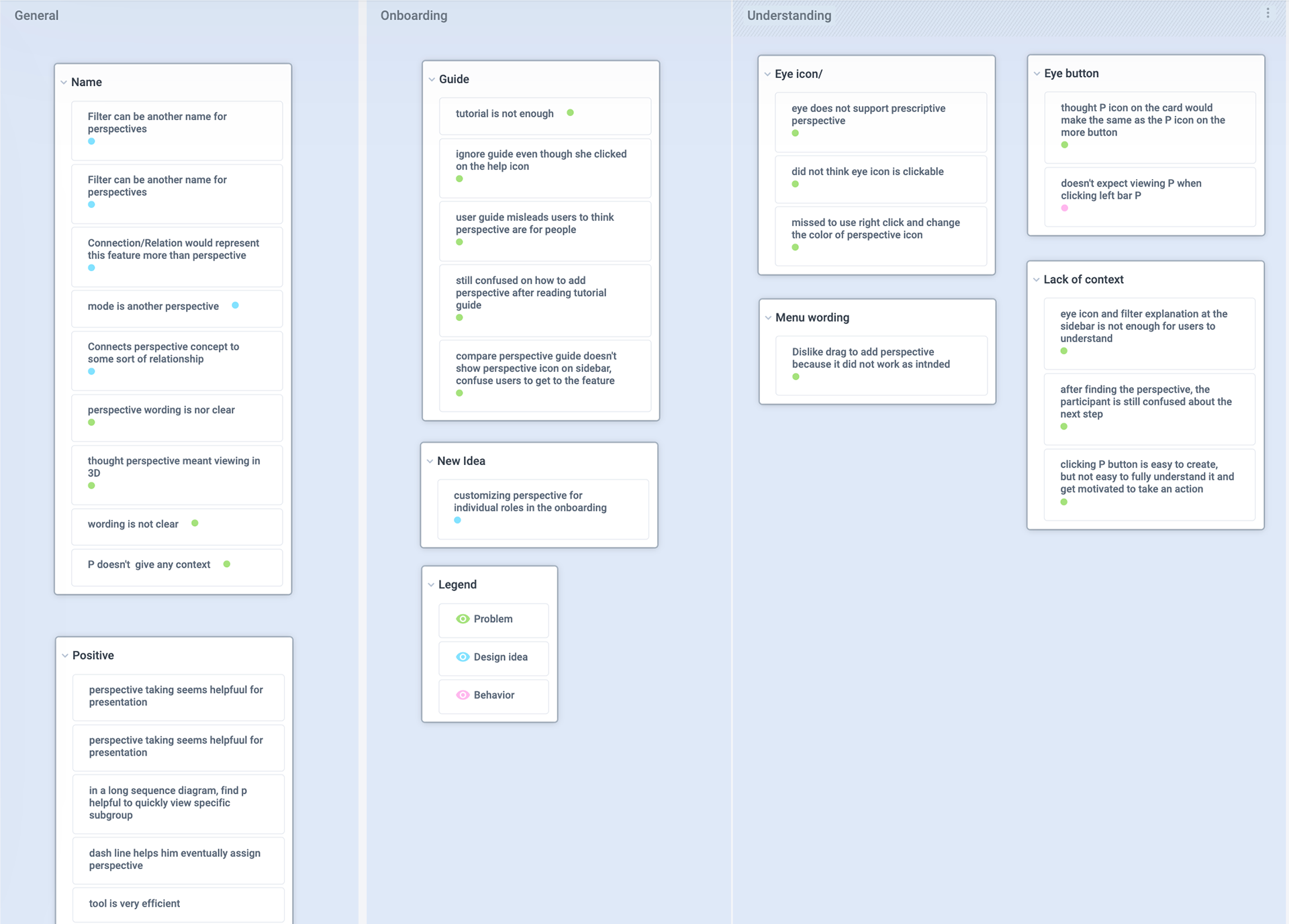
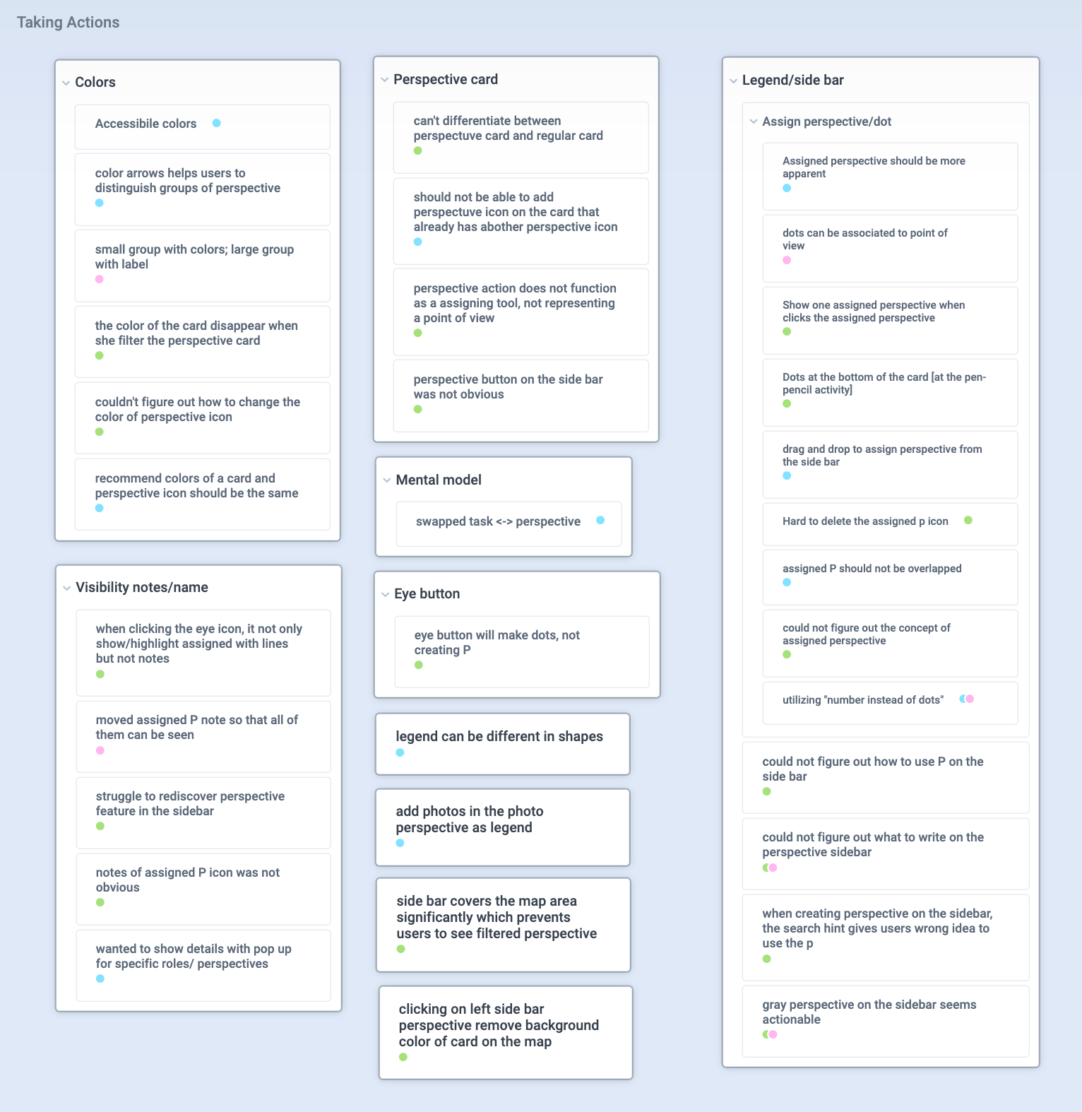
You can click the image to enlarge
From the user research findings, we individually came up with our own design to solve the usability problems.
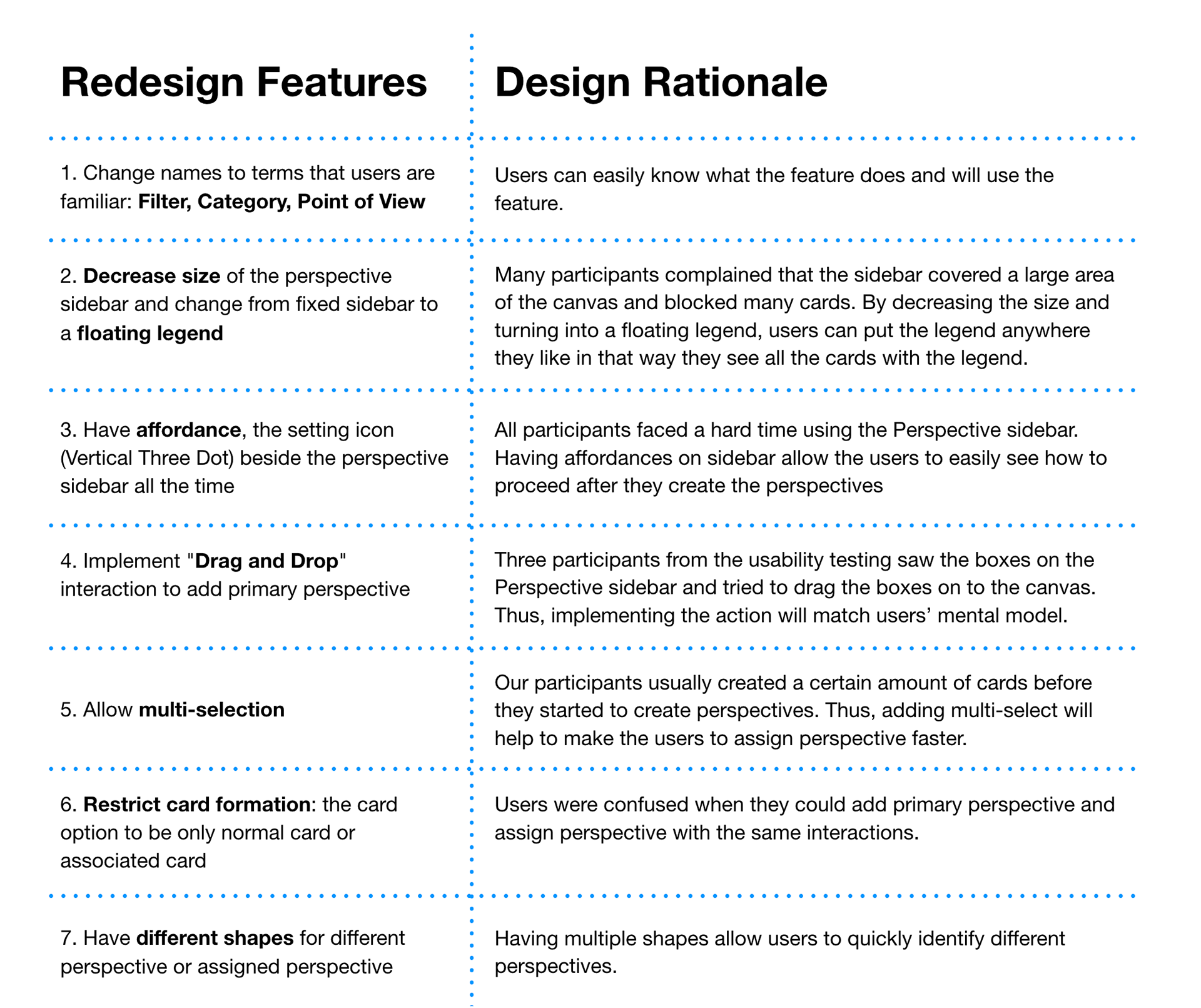
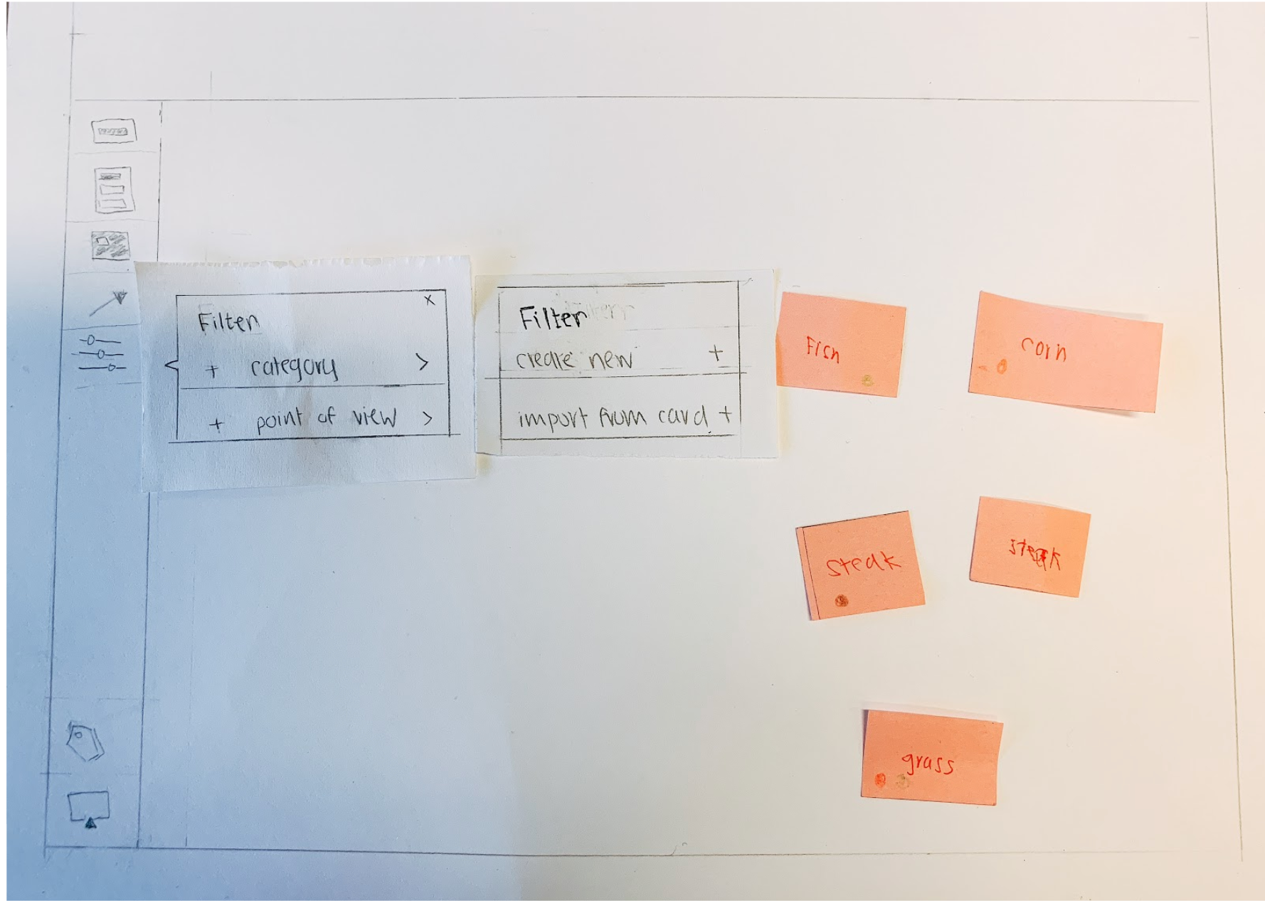
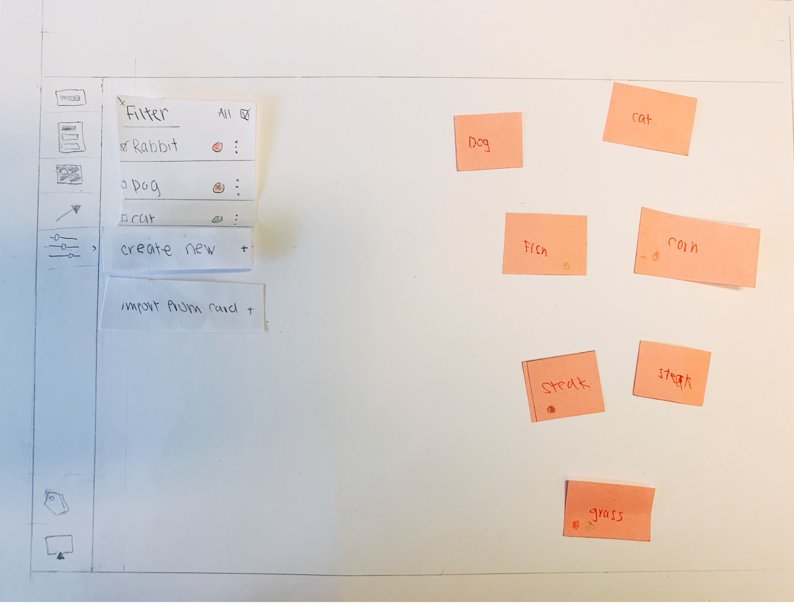
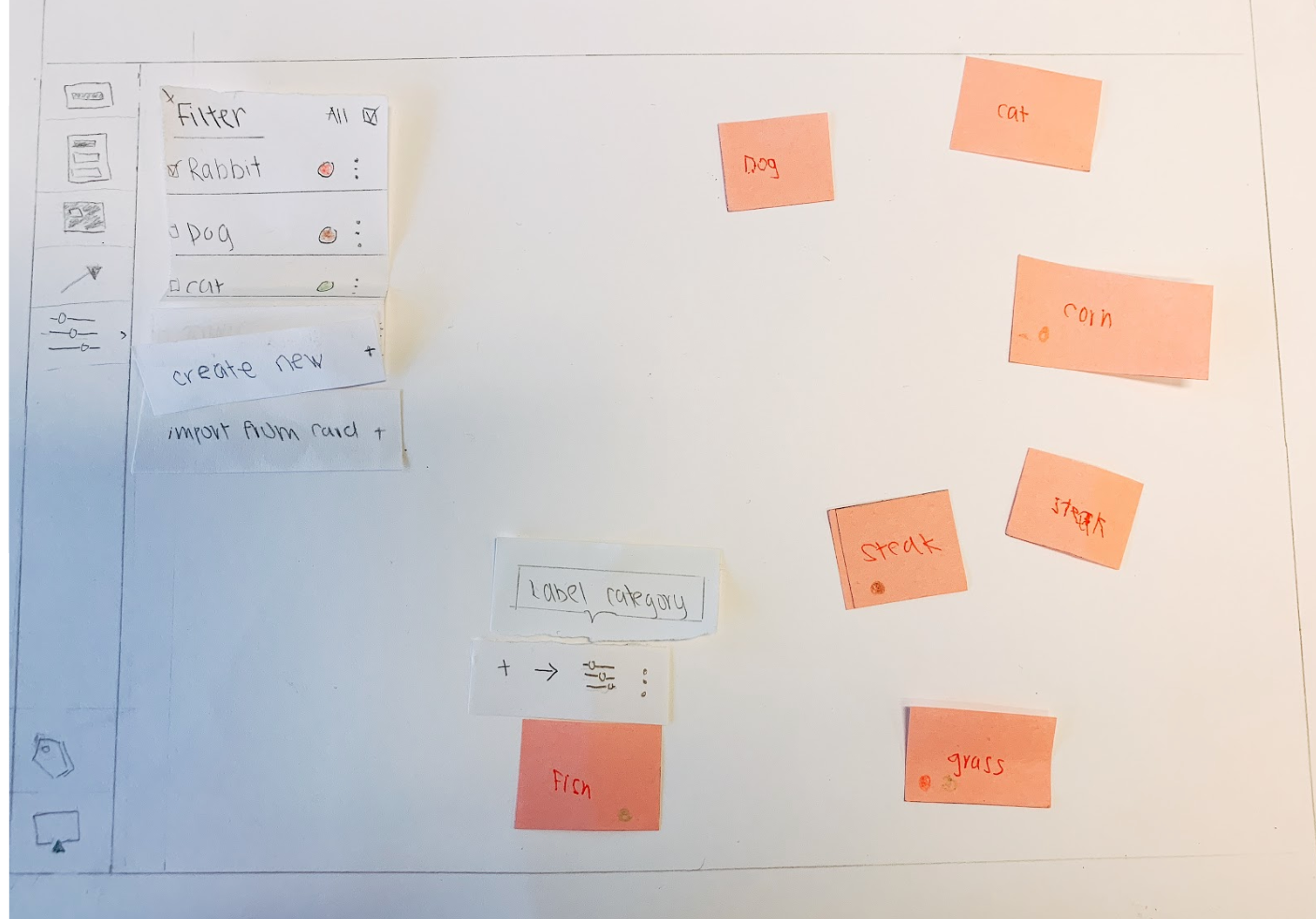
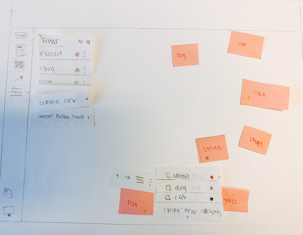
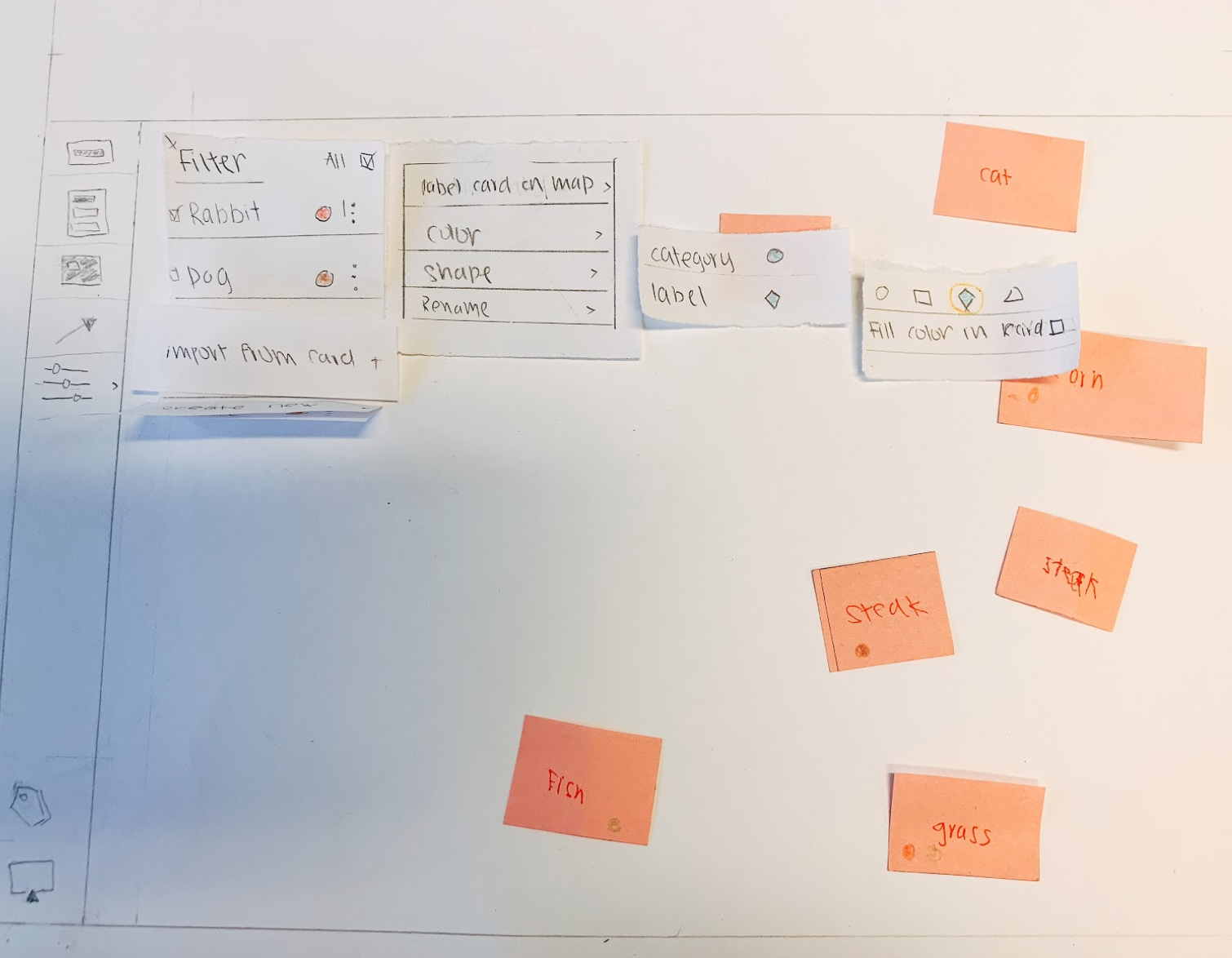
MY REDESIGN CONCEPT:
CATEGORY AND POINT OF VIEW FILTER
CATEGORY AND POINT OF VIEW FILTER
While keeping the same concept of having a Primary Perspective and Assigned Perspective,
my concept focuses on exploring ways to clarify the concept of ‘Perspective-giving,’ so they can understand and will use it.
First, the name changes from “Perspective” to a common action that most of the users understand: “Filter Category” and “Filter Point of View”.
By changing to a familiar name that explains the function, my hypothesis is that the user can understand immediately after seeing the name.
By changing to a familiar name that explains the function, my hypothesis is that the user can understand immediately after seeing the name.
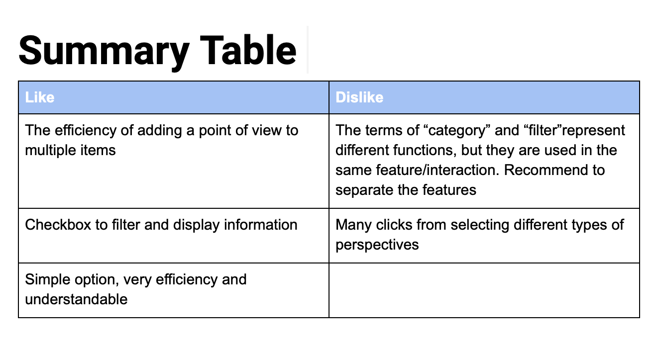
To assess whether the concept has improved the performance of the Perspective-taking, we performed quick concept testings with each of the designs with seven participants.
We allowed the participants to explore the paper prototypes and gave them some guidance during the walkthrough. At the end, we asked them for feedback.
The feedback is shown in the Summary Table.
We allowed the participants to explore the paper prototypes and gave them some guidance during the walkthrough. At the end, we asked them for feedback.
The feedback is shown in the Summary Table.
Unfortunately, I did not get to test the different shapes for primary Perspective and assigned
Perspective due to lack of test time.
Perspective due to lack of test time.
Plectica Team Feedback
1. Like the idea behind of breaking Perspective into Category and Point of View because it's harder to conceptually wrangle around the idea that Steak is POV (point of view) of Meat v.s Steak is in the category of Meat
2. Worth exploring is how color and icon/shapes play into perspectives
3. Concern: the language of "Import on card (on the paper prototype)" would be heavy/confusing for the users
After discussions, we merged the interactions that the participants like and developed wireframes.
Then we did another round of usability testings with high-fidelity prototype using inVision. The recruited participants are those have similar background as the first round.
Thus, we can easily see the difference between the versions.
Then we did another round of usability testings with high-fidelity prototype using inVision. The recruited participants are those have similar background as the first round.
Thus, we can easily see the difference between the versions.
HIGH FIDELITY PROTOTYPE REDESIGN
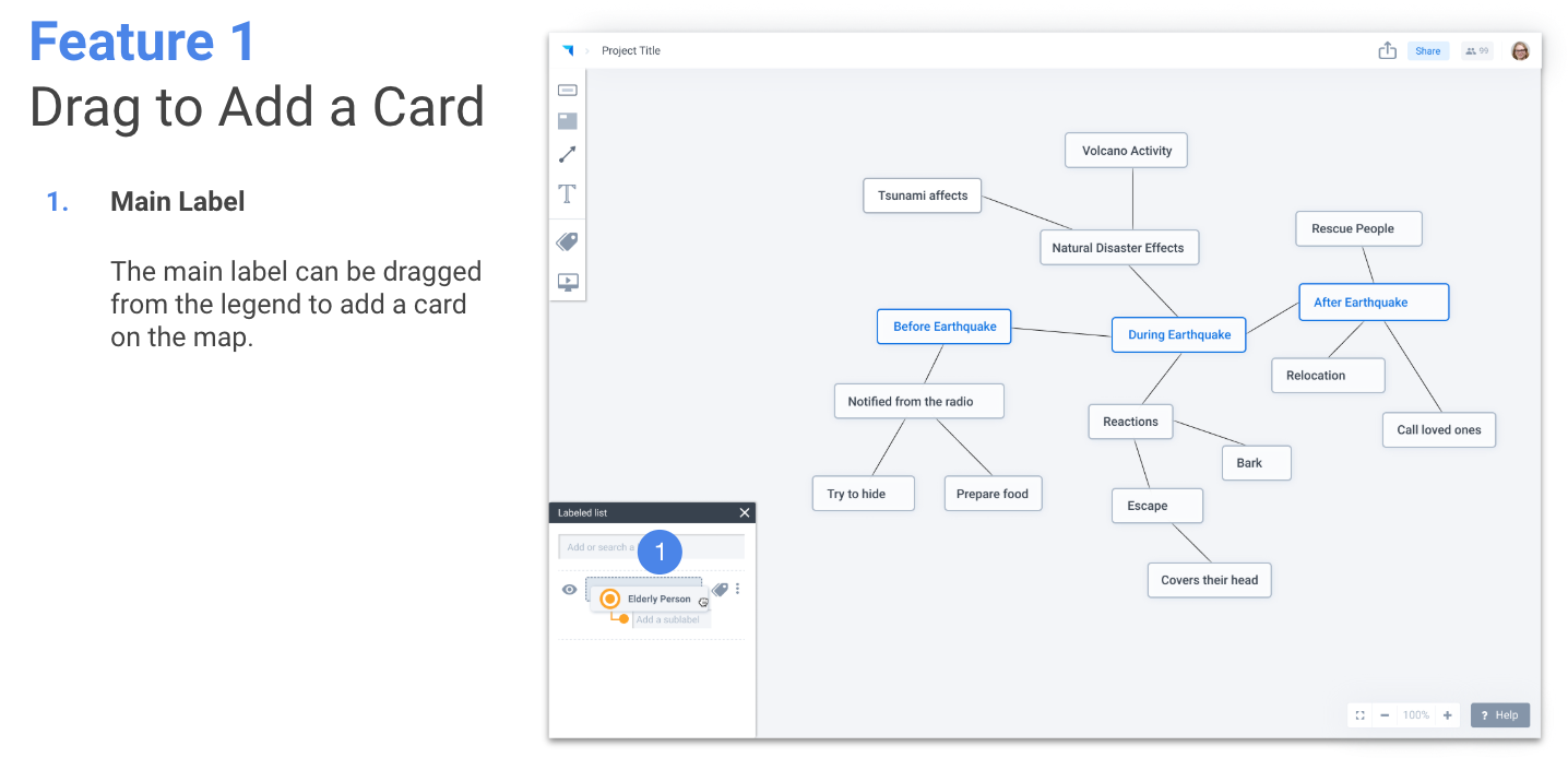
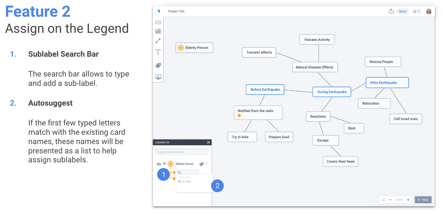
The most important concept contribution that I made (see images below for reference):
1. Perspective-taking template
To encourage users to utilize the "Perspective-taking" feature for different scenarios
(not only person's perspective), I came up with the idea of the template (Person)that
allows the users to know that it can be for grouping relation, category relation, and
person's point of view relation.
To encourage users to utilize the "Perspective-taking" feature for different scenarios
(not only person's perspective), I came up with the idea of the template (Person)that
allows the users to know that it can be for grouping relation, category relation, and
person's point of view relation.
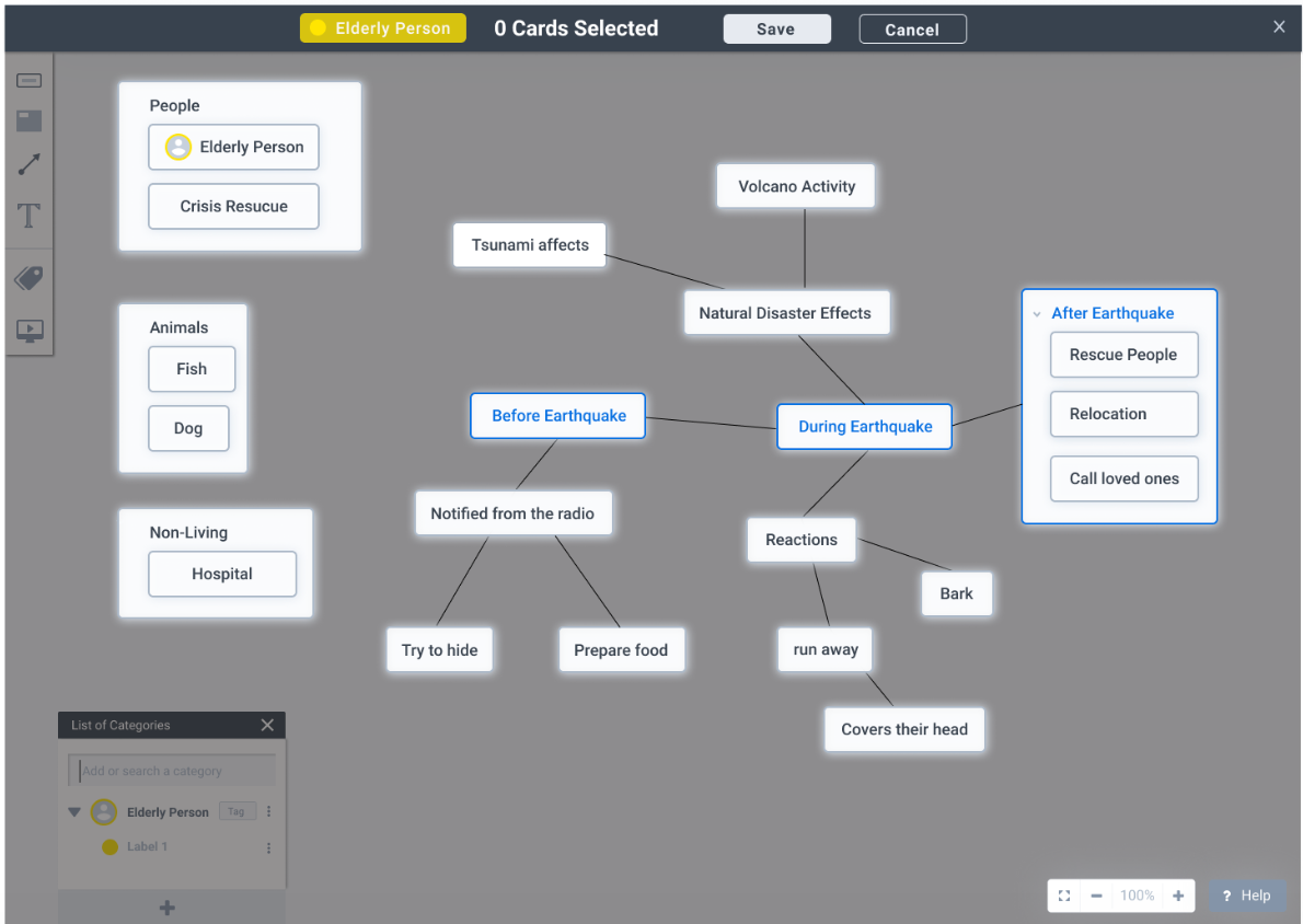
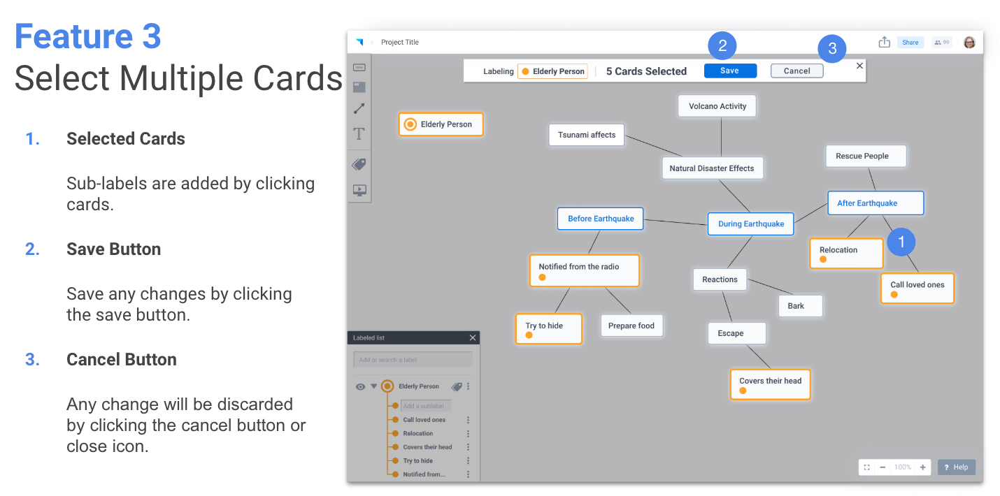
2. Multi-selection (Keeping my concept from previous testing)
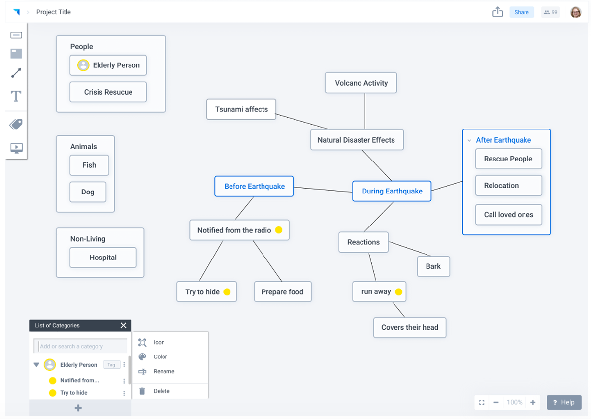
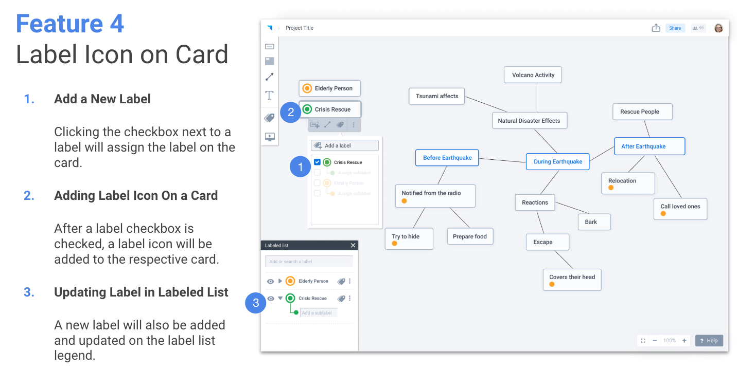
3. Having a "Tag" button at the sidebar
To give users affordances after they create the perspectives (Issues from usability
testing round 1)
3. Having a "Tag" button at the sidebar
To give users affordances after they create the perspectives (Issues from usability
testing round 1)
1. PERSPECTIVE-TAKING TEMPLATE
2. MULTI-SELECTION
3. CLEAR TAG BUTTON IN LEGEND
Below is the summary table that I made for the designers to refine the prototypes.
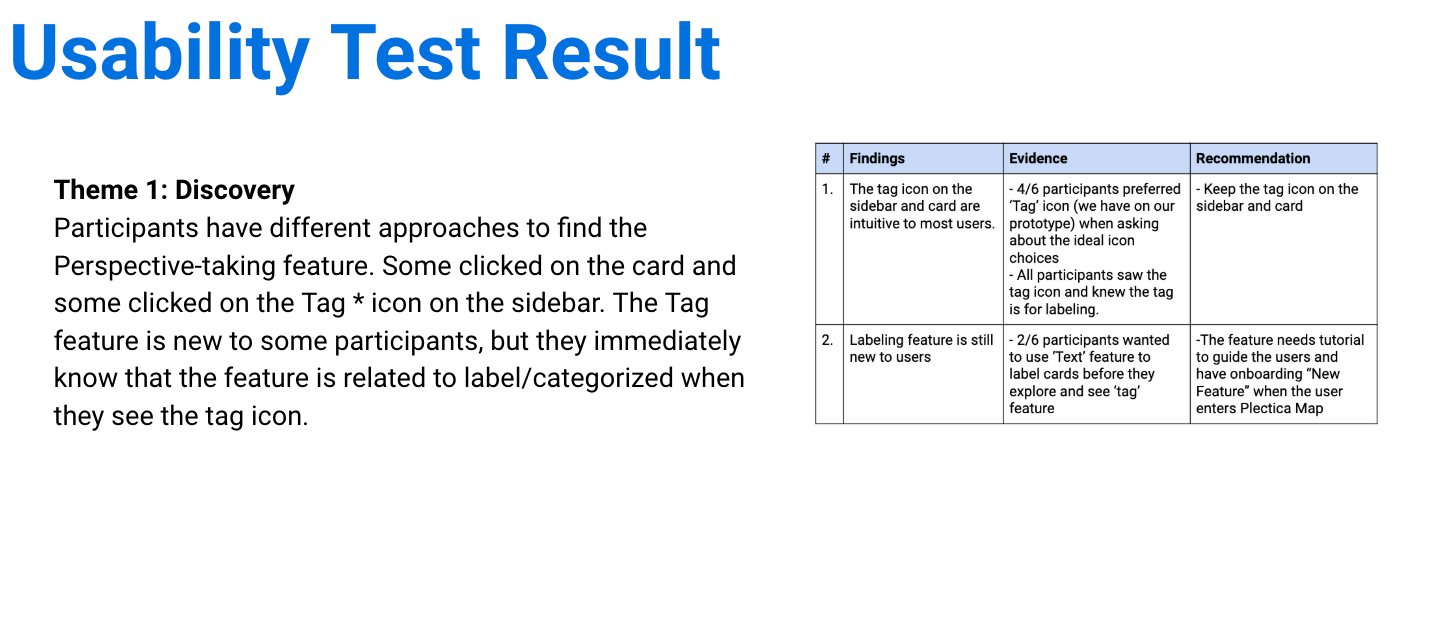
During the second round of the usability testing, all users understood higher level of "Perspective-taking" feature compared to all users from usability testing that all were confused.
One participant said
"it may take two or three tries at most to figure out how to use the too and it is intuitive to use after that "
FINAL PROTOTYPE
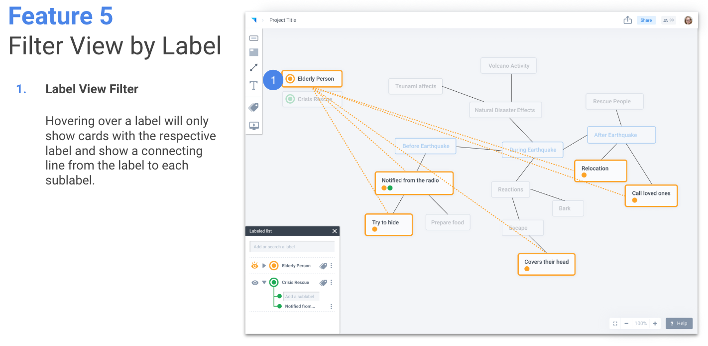
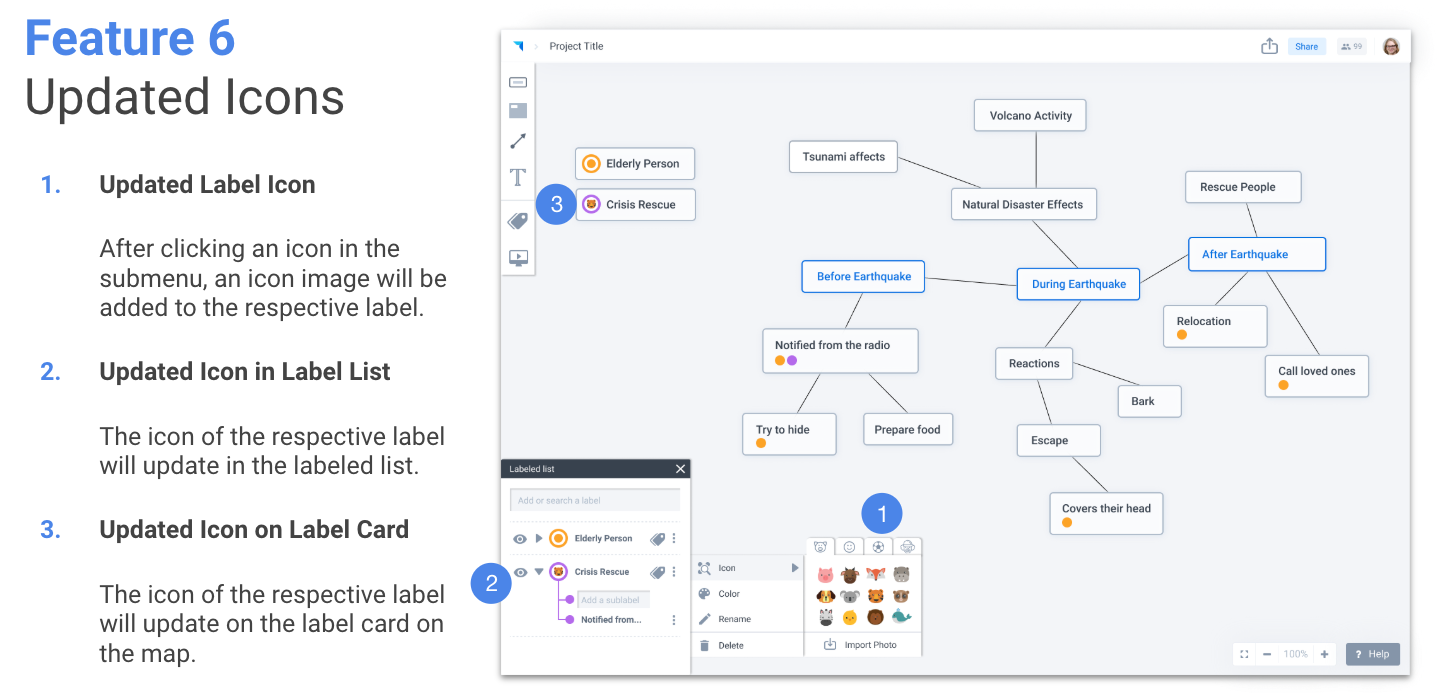
We focused on refining three main features: drag-to-add, adding labels using the card menu, and final wording/icons around the “perspective” feature. The final redesigned wording attempts to use simplistic and easy-to-understand wording, “Label” and “Sub-label”.
Next Steps
I would like to dive deeper on the name of the feature for Perspective. After this capstone, I realized that content strategy is very impactful to the users' understanding of the feature, especially a new feature like Perspective. During the first round of the user testing, participants had tough times understanding of what Perspective-taking did. (Side note: One participant thought Perspective feature allows the diagram to be 3D.)
Thank you Plectica for the opportunity to redesign the feature.