King County Public Health Communities Count Website Redesign: Communities Count
I interned at Communities Count under King County Public Health at APDE (The Assessment, Policy Development and Evaluation Unit) to redesign their public-facing website, Communities Count.
Duration: 10 months
Role: UX Intern (research, wireframe, prototype, develop)
Role: UX Intern (research, wireframe, prototype, develop)


BACKGROUND
Communities Count website delivers assessments and evaluation of King County population-data to monitor the health and well-being of King communities and to assist with the grant funding decision. The current website is created in 2012 and has not updated with the design.

Before analyzing the performance of the current website, I familiarized myself with the current website by examining the heuristic evaluation. Utilizing the Google Analytics provides a quantitative analysis of how the website is performing; I also read the Communities Count executives interview to understand business requirement and dug into similar data portal website redesign research.
With the help of the usability testing, I understood the pain-point of the current users and delivering recommendations on how the website could improve.
Heuristic evaluation-> Google Analytics -> Interview -> Usability Testing
HEURISTIC EVALUATION
I evaluated the current website based on Nielsen’s 10 usability heuristic rules.
I found that the major problems lie in “Match between system and the real world”, “Flexibility and Efficiency of use”, and “Help & Documentation."
I found that the major problems lie in “Match between system and the real world”, “Flexibility and Efficiency of use”, and “Help & Documentation."

GOOGLE ANALYTICS
To understand how the website performance, I have studied the Google Analytics.
The metrics that I have heavily focus are:
1. Bounce rate for each page
2. Average session duration for each page
3. Top pages
The metrics that I have heavily focus are:
1. Bounce rate for each page
2. Average session duration for each page
3. Top pages

CONNECTED WITH BUSINESS REQUIREMENT
I read over the meeting notes from the APDE staff to have an in-depth of what their service, their targeted audience, and design goal and requirement.
The overarching expectation:
A modern-looking website with intuitive navigation, efficient search function, and story-telling layout.
I read over the meeting notes from the APDE staff to have an in-depth of what their service, their targeted audience, and design goal and requirement.
The overarching expectation:
A modern-looking website with intuitive navigation, efficient search function, and story-telling layout.
COMPARATIVE ANALYSIS
Reading the user research from Community Health Indicators (CHI, a partnership with Communities Count) to get an understanding of the convention problem that data portal website has faced.
Reading the user research from Community Health Indicators (CHI, a partnership with Communities Count) to get an understanding of the convention problem that data portal website has faced.
INTERVIEW + USABILITY TESTS
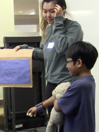
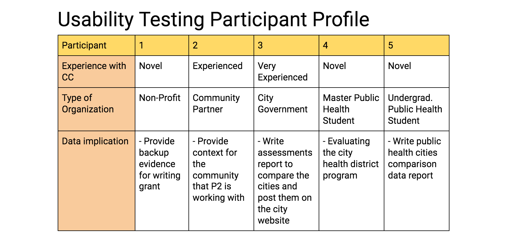
We hosted 5 usability testings with the different kinds of users with the format of background interview, impression test, first-click testing, cognitive-walkthrough with concurrent think aloud exercise, wrap-up interview questionnaires.
We hosted 5 usability testings with the different kinds of users with the format of background interview, impression test, first-click testing, cognitive-walkthrough with concurrent think aloud exercise, wrap-up interview questionnaires.
MAJOR USABILITY ISSUES
NAVIGATION:
- Hard to find specific indicators
- Unsure which topic the specific indicator lay at
- Easy to miss the indicator because several sidebars contains too many indicators with inconsistent
subcategory labels
CONTENT OF THE WEBSITE:
- Unsure what Communities Count can offer
- Hard to find specific indicators
- Unsure which topic the specific indicator lay at
- Easy to miss the indicator because several sidebars contains too many indicators with inconsistent
subcategory labels
CONTENT OF THE WEBSITE:
- Unsure what Communities Count can offer
EASE OF USE:
- Novel users sometimes did not know that the visualizations are clickable
- Some visualizations were hard to comprehend with no public health background
- Instructions are not prominent for users to find
- Novel users sometimes did not know that the visualizations are clickable
- Some visualizations were hard to comprehend with no public health background
- Instructions are not prominent for users to find
I used Adobe XD for the wireframes to present to the team.

Communities Count executives wanted the website to stay a somewhat consistent look, so that the users would be too surprised with the redesign.

A screenshot of a prototype that I design which incorporates the drop-down menu.
NAVIGATION:
- Drop-Down Menu: Allows users to preview the indicator in the topic
before they click on the topic
CONTEXT OF THE WEBSITE:
- Automatic Carousel on landing page: Having different slides, such as
Fast fact, What's new, and Mission allow the users to get a broad idea of what
Communities Count offer
EASE OF USE:
- "How to use Communities Count" video: Allows the users to learn the
function of the visualization easily
- "Guide to Read the Tableau Visualization": Allows the users with non-
public health background to have a more robust context of the visualization
The website is officially launched!
Check out: Communities Count
Check out: Communities Count
The cute graphics are designed by my talented colleague, Navi Midathada
REFLECTION
I am very grateful for the opportunity to intern at King County to see the first-hand redesign website process from the initial website design, research usability problem, to rebranding and launching the website.
Time management and work prioritization are the top lesson that I've learned throughout the entire internship experiences. Always be adaptable as many of the planning will get changed.
Always utilize online resources to learn more about different website designs.
Listen more.
Look more.
Read more.
Listen more.
Look more.
Read more.