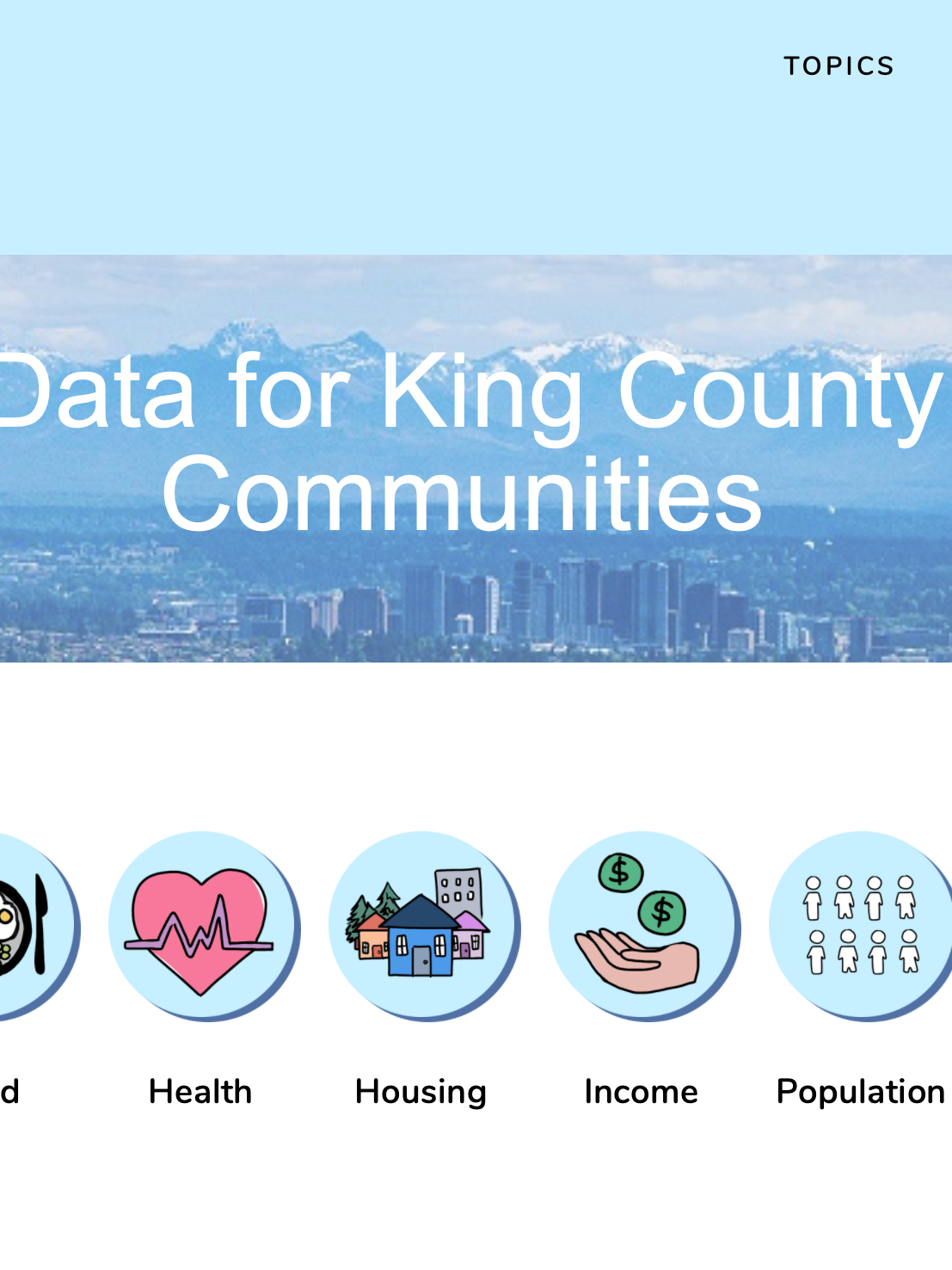
Have you ever checked out your public library website? Do you have an idea on how much free resources you can utilize?
SUMMARY
As a group of students, we agreed that we are a major group who would like free resources. Currently, we are in the progressive learning periods, so Seattle Public Library is a great resource for us.
Although Seattle Public Library provides many resources, many of us found the website hard to navigate and failed to utilize the resources. Thus, we made a website usability studies on Seattle Public Library.
Team Members: Sharon Heung, Vrishti Bhowmik, Scott Tan
Duration: 8 weeks
Role: User Researcher
Team Members: Sharon Heung, Vrishti Bhowmik, Scott Tan
Duration: 8 weeks
Role: User Researcher
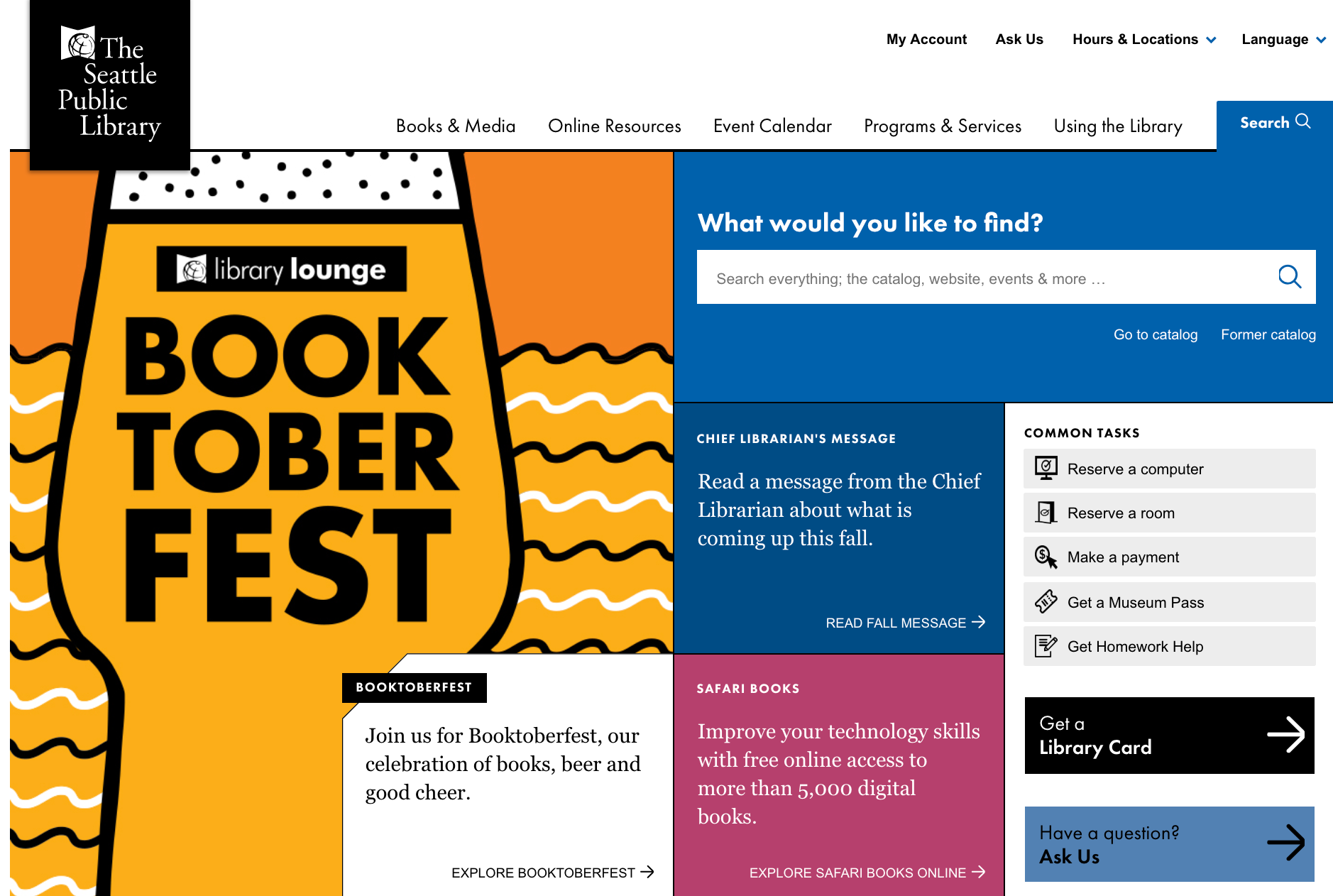
Seattle Public Library Website
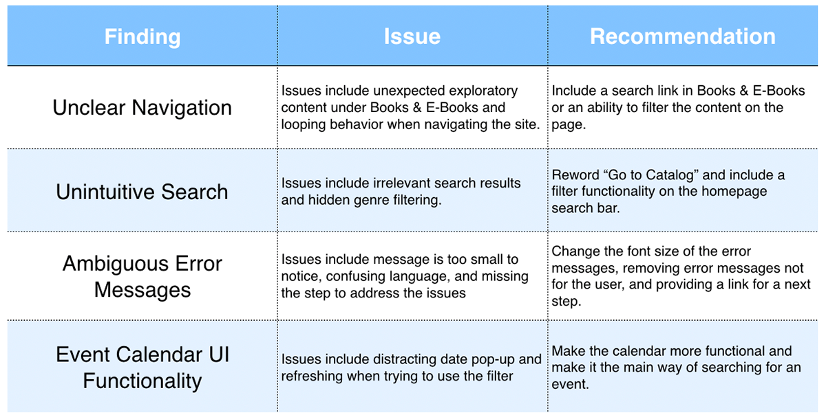
TOP FOUR FINDING SUMMARY TABLE
BACKGROUND
The Seattle Public Library website provides Seattleite with an overview of the resources: book and media, online resources, events, activities, and programs and services that are offered in the Seattle libraries.
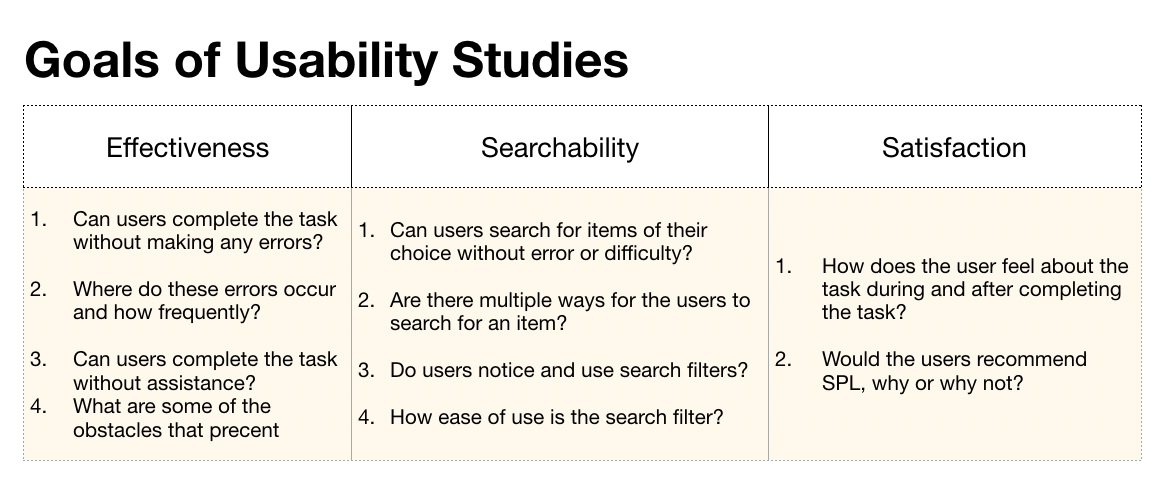
With the goal of increasing site retention and improving user engagement,
our research aims to assess the effectiveness, searchability, and satisfaction of SPL website users.
our research aims to assess the effectiveness, searchability, and satisfaction of SPL website users.
RESEARCH PROCESS
Individual Heuristic Evaluation & Cognitive Walkthrough ->
Screening Survey -> Interview -> Usability Testing -> Survey
METHOD
1. Individual Cognitive Walkthrough:
Evaluate the website through 2 common tasks to understand the first experience of new users,
discover what problems users will encounter, and how easy can users perform the
common tasks.
2. Individual Heuristic Evaluation from Jakob Nielsen:
Assess the website with a set of typical website usability principles to give a more holistic
usability inspection.
3. Usability Testings with Userzoom
Assess effectiveness, searchability, and overall satisfaction of the website
1. Interview: Understand users' background
2. Think aloud with Task Completion: Understand users' thought process while
performing a series tasks
3. Quick Survey: Learn about the overall task experience
01. COGNITIVE WALKTHROUGH
As a student, my common task is to borrow books from Staff Pick Books with a certain genre and DVD from recent popular list.
As a student, my common task is to borrow books from Staff Pick Books with a certain genre and DVD from recent popular list.
First task is to borrow a book from American Classics genre.
Second task is to borrow DVD that is under Adult Popular List.
Second task is to borrow DVD that is under Adult Popular List.
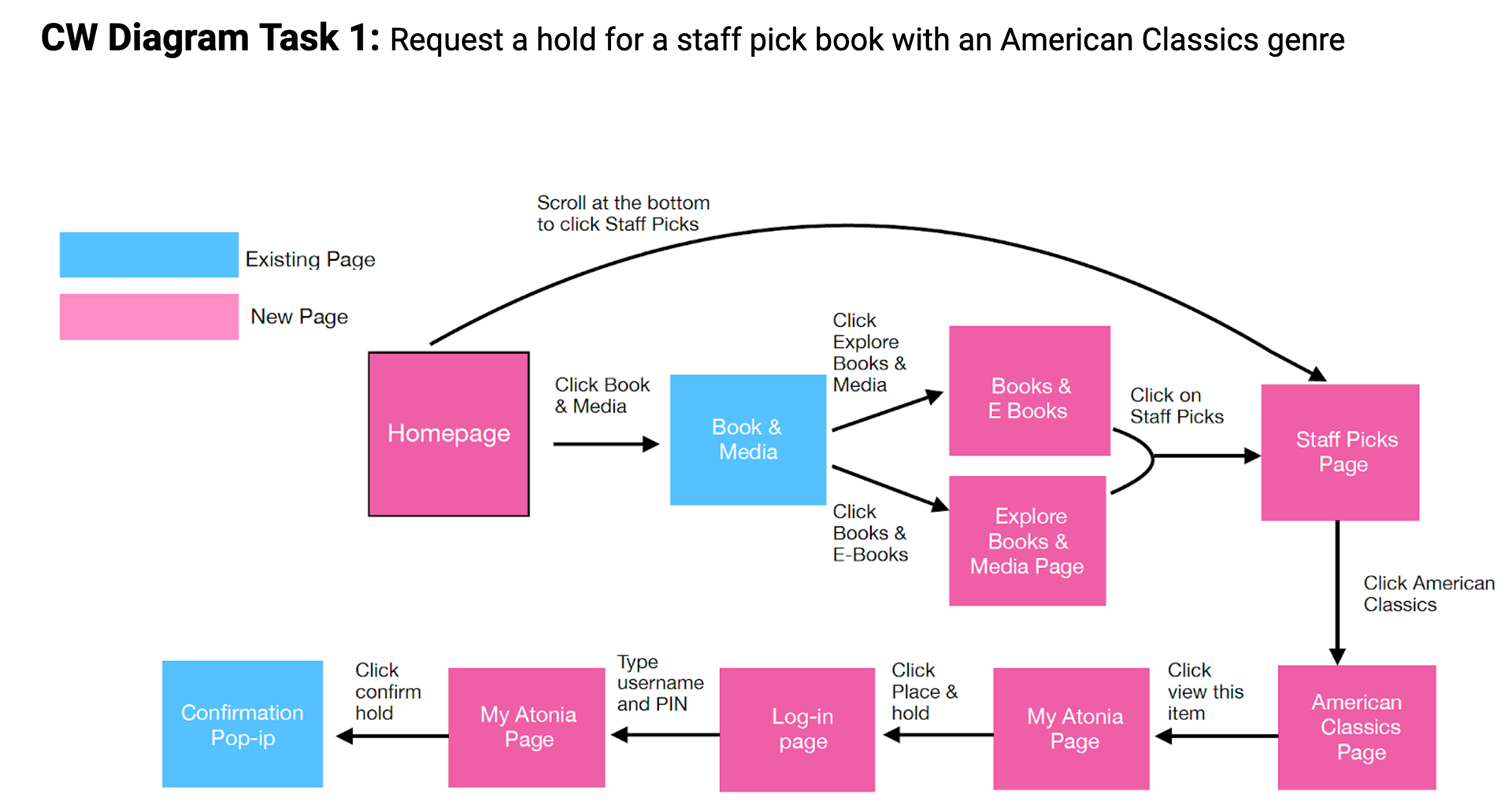

Below are the steps that I took and the issues that I encountered during my first cognitive walkthrough- reserve a book named Antonia.
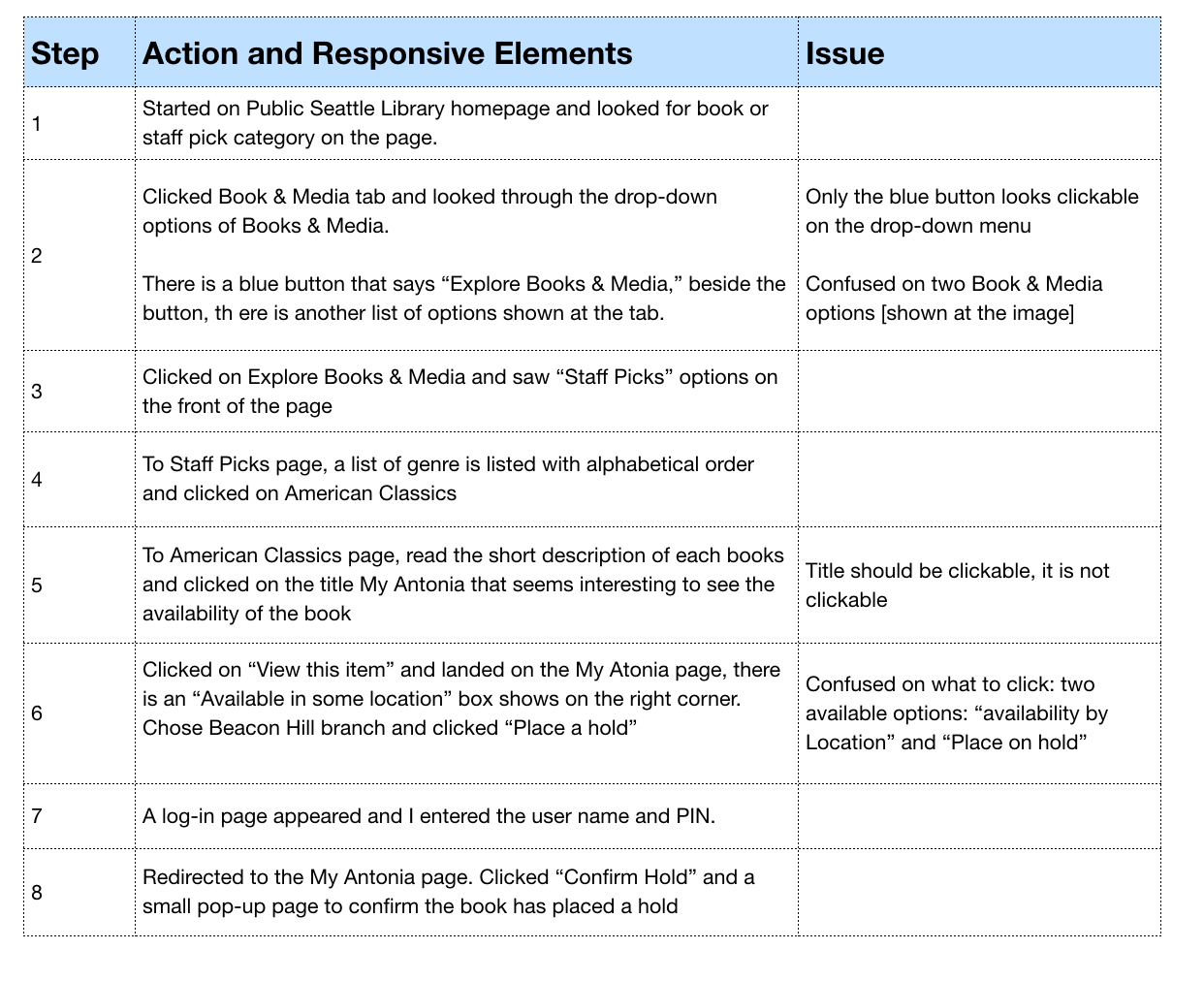

Issues highlighted with each steps
Common Issues in CW
01. Some of the options on the same page look similar.
Impact: May cause users to have decision-fatique.
Recommendation: Change names of the buttons to emphasize the distinction, so the users would not need to think before they click. Another way is to get rid of buttons or links that have the same objectives to avoid confusions.
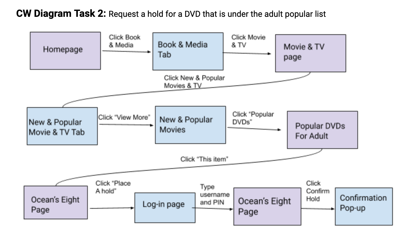
Second CW task with step flows
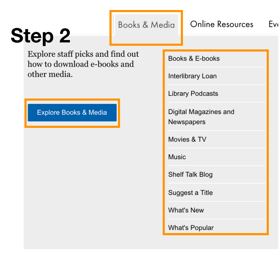
02. Drop down menu does not clickable (Image shown in the right).
Recommendation: Remove blue button and the "Explore Staff picks..."
words. The words and the buttons are unnecessary. By removing those, it
can prevent users' confusion and the UI will look minimalistic and aesthetics.
03. Several pages has same content but in different formats.
Impact: Inconsistency can caused confusion
Recommendation: Standardize all pages and remove pages that have the
same content but with different format.
same content but with different format.
From the CW + HE, I discovered that the major issues are under “Consistency and Standards” and “Match Between System and the Real World” heuristic.
After familiarize SPL website with cognitive walkthrough, I assess with Jakob Nielsen’s heuristic evaluation to assess the SPL website.
02. JAKOB NIELSEN HEURISTIC EVALUATION
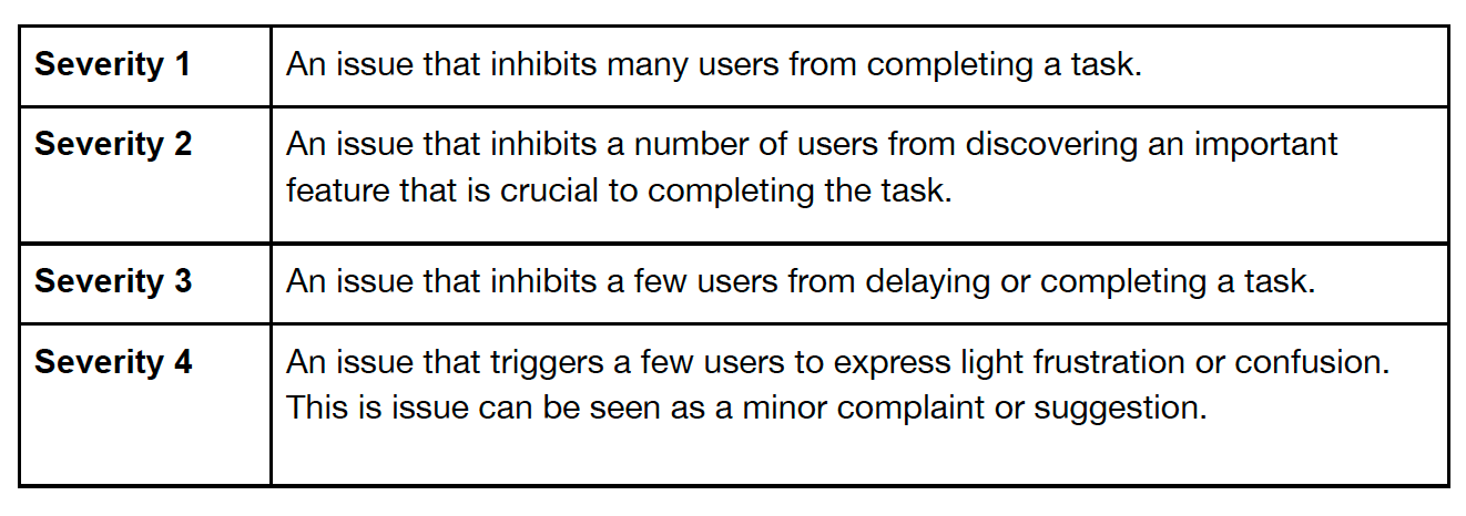
The severity rating is judging by
0 = I don’t agree that this is a usability problem at all
1 = Cosmetic problem only:
need not be fixed unless extra time is available on the project
1 = Cosmetic problem only:
need not be fixed unless extra time is available on the project
2 = Minor usability problem:
fixing this should be given low priority
fixing this should be given low priority
3 = Major usability problem:
important to fix, so should be given high priority
important to fix, so should be given high priority
4 = Usability catastrophe:
imperative to fix this before the product can be released
imperative to fix this before the product can be released
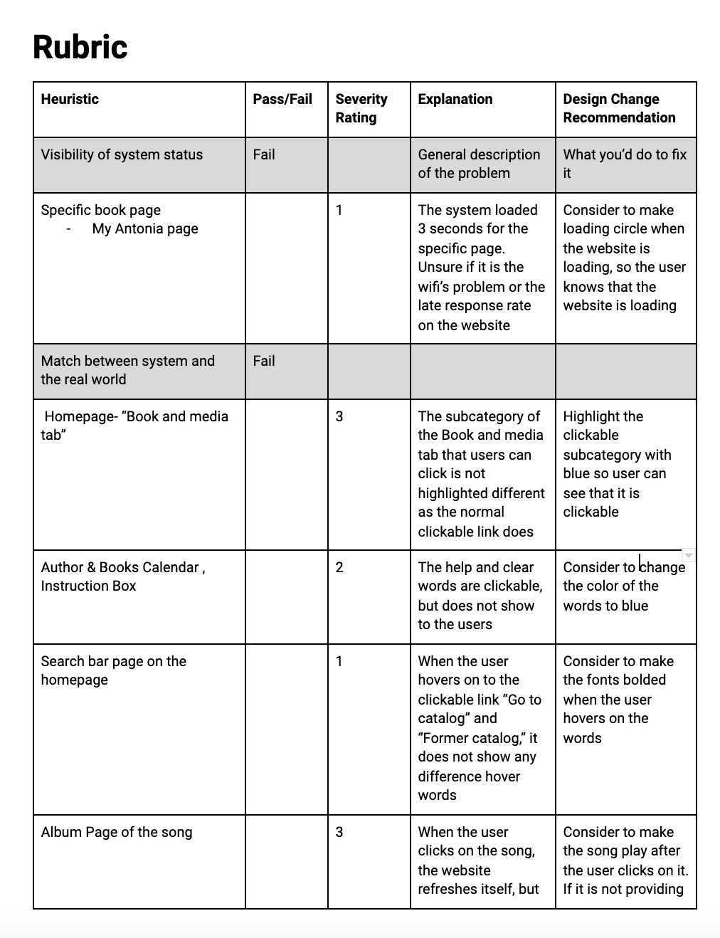
1 / 3 page of the heuristic evaluation conducted by me
Click Heuristic Evaluation to see a comprehensive report.
REOMMENDATION
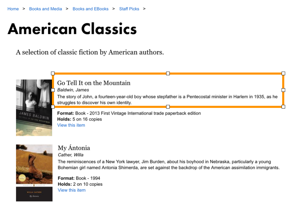
From the severity rate point, I suggest the developer to prioritize to make the clickable links more apparent. One way is to change the link from bottom "View this item" to the top as to follow the hierarchy convention.
It's intuitive for users to click on the first thing they see, such as the title of the book for additional detail. Thus, having a "View this item" link will not be necessary.
It's intuitive for users to click on the first thing they see, such as the title of the book for additional detail. Thus, having a "View this item" link will not be necessary.
03. USABILITY TESTINGS WITH 8 ppt
After collecting my individual evaluations, I have identified several problems regarding searchability and task effectiveness. In order to discover a holistic usability issues, I grouped with 3 other teammates to conduct 8 sets of 50-minutes usability testings with different participants with one pilot study.
Usually, the standard number of participants is five. However, this is our first time using Userzoom and we might encounter technical issues during the testings, we recruited eight participants with one pilot to be safe.
All participants had experience and knowledge of using the University of Washington’s library website, but most were unfamiliar with the SPL website. We excluded participants who had used the website in the last three months to ensure that novel users, who were unfamiliar with the website, would be able to utilize the library website’s resources; therefore, the findings from the study provided insights on how to improve access to these services.
Participant Profile
Age: 18- 24
Gender: 3 make; 5 females
Occupation: Full time college student
Exclusion Criteria: No prior experience
using SPL website within last three months
Gender: 3 make; 5 females
Occupation: Full time college student
Exclusion Criteria: No prior experience
using SPL website within last three months
Flow of usability testing:
Background Interview -> 5 sets of Task Completion ->
Each Tasks follow by a Short Survey ->
Post-Test Debrief
Background Interview -> 5 sets of Task Completion ->
Each Tasks follow by a Short Survey ->
Post-Test Debrief
We will focus on the three main goals for our usability testings.
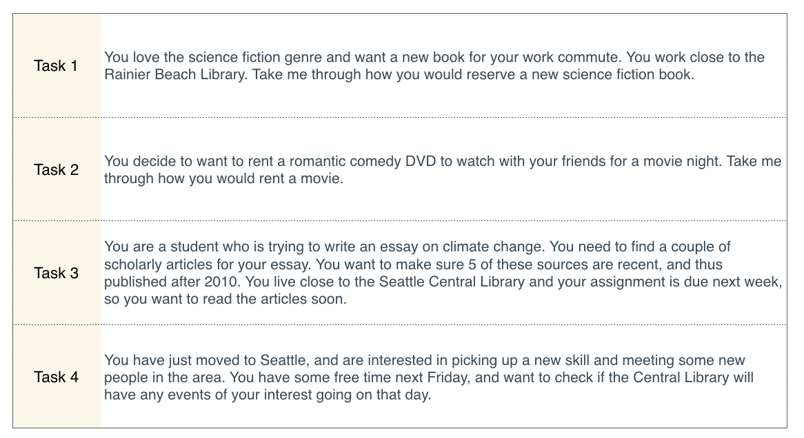
We had 4 tasks that were made to test searchability and browsing of media, ability to find academic articles and
the ease of use of the website’s event calendar. The table shows tasks that we asked our participants to complete.
the ease of use of the website’s event calendar. The table shows tasks that we asked our participants to complete.
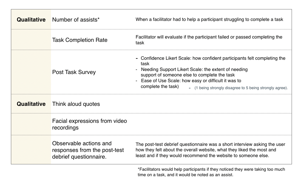
Data Metric
Quantitative:
1. Number of assists
2. Task completion success scale (0 as failure - 2)
3. Ease of Use Task scale (1 as the easiest - 5)
1. Number of assists
2. Task completion success scale (0 as failure - 2)
3. Ease of Use Task scale (1 as the easiest - 5)
Qualitative:
1. Pre and Post task completion interview notes
2. Think aloud notes
3. Evaluation of facial expression from recorded video
1. Pre and Post task completion interview notes
2. Think aloud notes
3. Evaluation of facial expression from recorded video
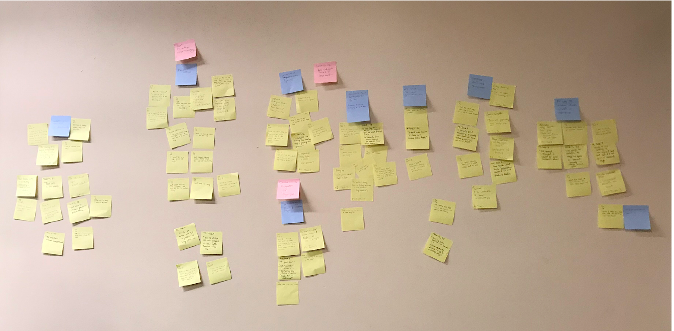
After the usability testings, we had a quick affinity diagram session and began to notice a pattern in the usability among participants.
Overall, multiple participants favored the visual design of the SPL website and complimented the website aesthetic. Some participants mentioned how “the website looks cool” and the “purple and white makes the website very catchy and calm”.
However, there were some usability issues that we thought could improve upon. We categorized the usability issues with four findings.
Each findings has a severity rating that helps the developer to prioritize the work.
Each findings has a severity rating that helps the developer to prioritize the work.
Finding 01: UNCLEAR NAVIGATION | Severity 2
5 / 8 participants commented on the unclear navigation in the post-study debriefing or during the task itself.
One participant in particular said “It looked organized, but it wasn’t organized”, expressing a trend that multiple participants encountered on the SPL homepage.
Each task started at the SPL homepage and all participants used the navigation bar on the homepage; however, participants struggled with finding content that they were looking for or expecting. Although this findings did not inhibit individuals from failing the task, this finding did influence participants to ask for assists.
"I didn't like the first task. I clicked on book and media and there were no filters" - P4, post-test
Common “looping” behavior included going from books and media to the staff picks section to the library information pages and then back to books and media.
"Oh I was here, wasn’t I? Okay great I am going on a loop. Fun.”
Recommendation
Execute card sort activities with targeted users to help design the information architect of a site will improve the navigation issues and reduce the amount of the clicks.
Execute card sort activities with targeted users to help design the information architect of a site will improve the navigation issues and reduce the amount of the clicks.
Finding 02: UNCLEAR INTUITIVE SEARCH | Severity 2
6/8 of the participants mentioned the genre filtering and issues with searching as an aspect that they least liked during our post-study questionnaire
IRRELEVANT SEARCH RESULT
Some people may noticed that there is a search bar at the top right corner and used it to search books or movies for the usability tasks. However, the search bar was inefficient to find what you want due to many resources inside the website.
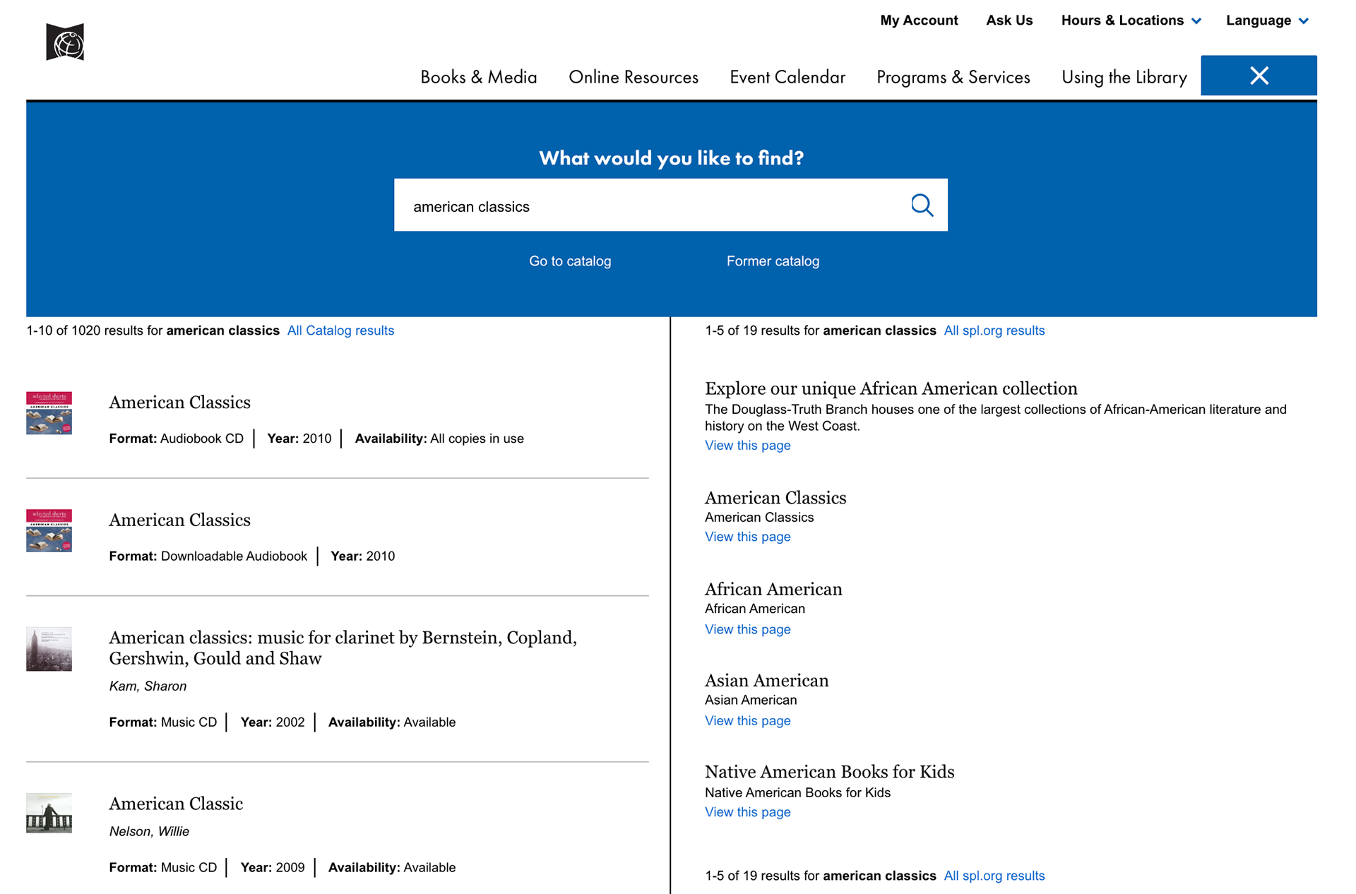
Participants may search American Classics for genre, but the result is the books or CD that has American Classics for the title.
Below are the original website design and a possible recommended design.
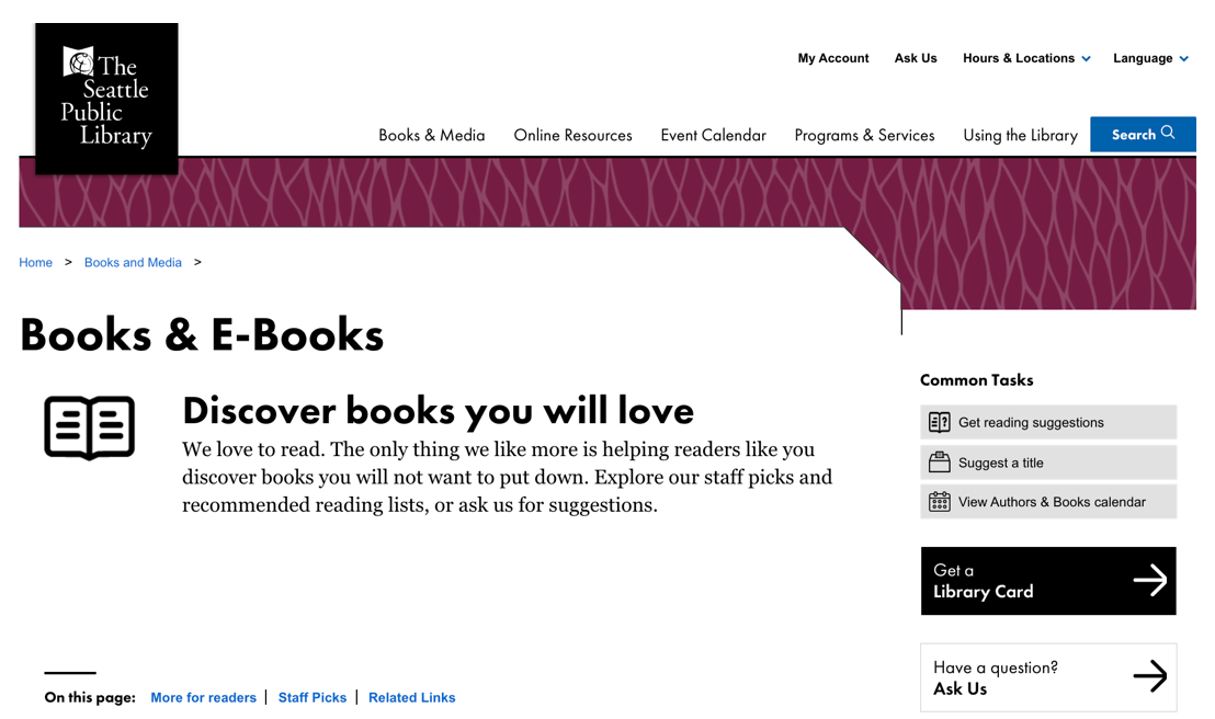
Initial website Books & E-Books page
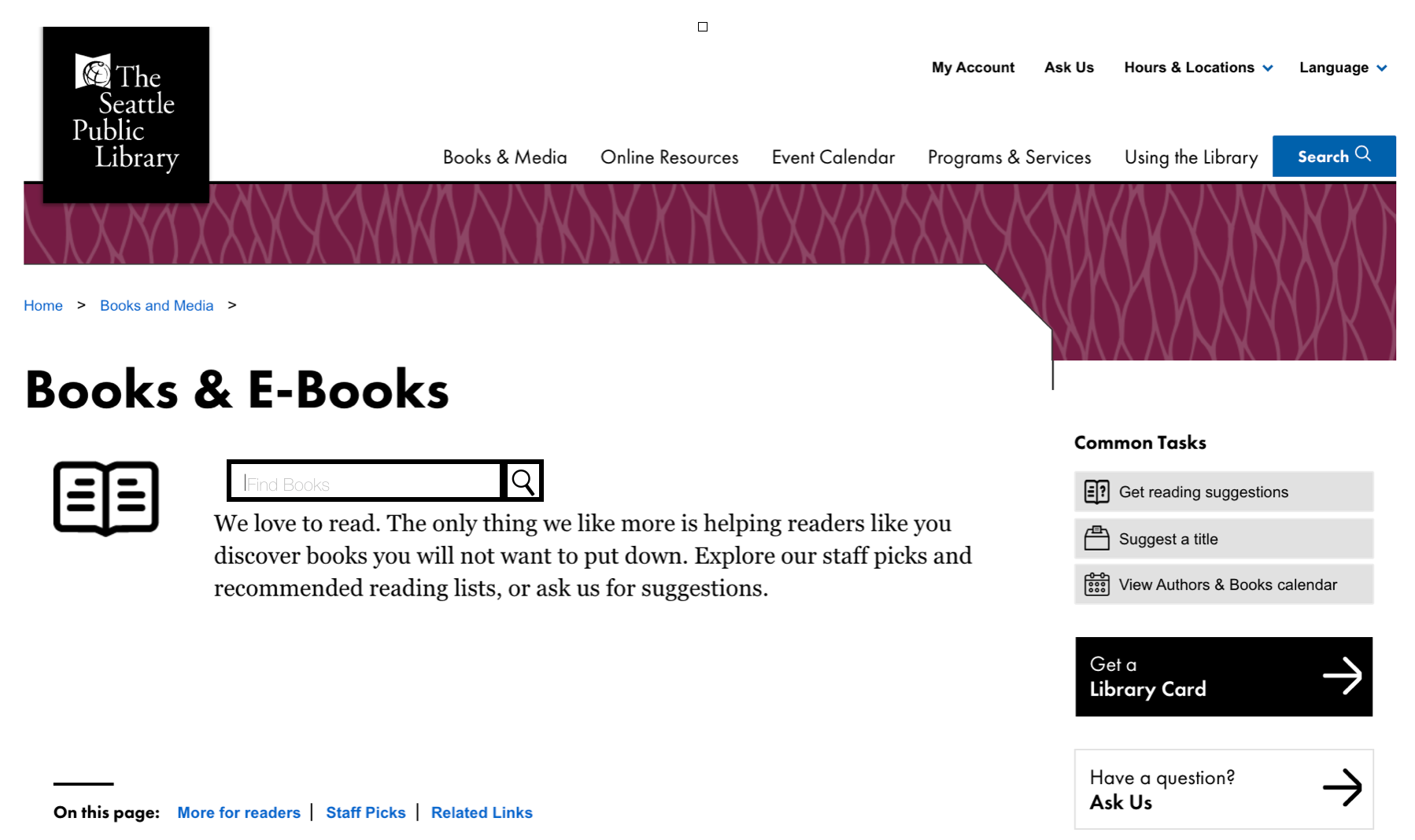
One design recommendation for Books & E-Books
Recommendation
Because many participants expected a search or filter functionality on the Books and Media page, it would be beneficial to include a heading or redirection for users to access the search functionality. Possibly including a section at the search bar with the text “search for books” in image at the right, would be a clear indication for users to know where to go.
This recommendation is a cost-effective solution in creating more clarity in the navigation.
Finding 03: UNCLEAR ERROR MESSAGE | Severity 3
All participants encountered error messages during the task completion, especially during task 3 when asked to search the online database. However, most of them were either confused of the error message or directly ignored the message.
“The red error is confusing, it is not
something that I can understand"
-P2 (Task 3)
something that I can understand"
-P2 (Task 3)
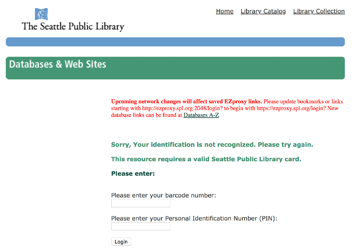
In terms of visual hierarchy, it’s common for participants to read text from top to bottom. Having the red text above the green text causes participants to miss out on the green error message below. Red color also tends to bring more attention than green color.
Additionally, although the green error message (text below red error message) explains to the user that the identification that the participants typed was not recognized, the message did not clearly show the users how to solve the error. 6/8 encountered the error message but none of the participants knew how to solve the issue.
Recommendation
Consider to remove the red message for the identification error message, since it is not intended for users. Having the text there will confuse users and makes the UI more complicated.
The most important message is the green message to inform the users the issue should be more apparent.
Consider to remove the red message for the identification error message, since it is not intended for users. Having the text there will confuse users and makes the UI more complicated.
The most important message is the green message to inform the users the issue should be more apparent.
“Sorry, Your identification is not recognized. Please try again.
This resource requires a valid Seattle Public Library Card.”
This resource requires a valid Seattle Public Library Card.”
Consider to show the steps to fix the error after defining the error. Instead of putting “How to get a library card” at the bottom, place it at the end of the green error message, so the participants would be able to know how to proceed with the next step, get a library card.
CONCLUSION
This usability study revealed issues that limit users from maximizing their library use. Overall, we were able to dig deep into the obstacles users faced while interacting with the website, and suggested ideas to redesign and improve the experience. We successfully identified the issues by conducting in-person usability tests with eight participants throughout a week.
This usability study revealed issues that limit users from maximizing their library use. Overall, we were able to dig deep into the obstacles users faced while interacting with the website, and suggested ideas to redesign and improve the experience. We successfully identified the issues by conducting in-person usability tests with eight participants throughout a week.
NEXT STEP
● Run a large scale survey to regular library users and understand their general habits and
experiences using the SPL.org website.
experiences using the SPL.org website.
● From the people who answered the survey, recruit a few interested participants to conduct a
participatory design session. This is to ensure that we are designing with the mental model of a
regular Seattle Public Library user.
participatory design session. This is to ensure that we are designing with the mental model of a
regular Seattle Public Library user.
● Research other existing library websites elsewhere that have successfully engaged their users.
Then, use these websites as inspiration for redesigns.
Then, use these websites as inspiration for redesigns.